Preview image. Unlock full-res
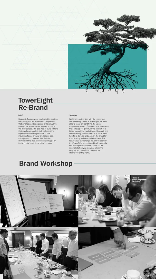
A brand refresh case study featuring a stylized tree with visible root system against a teal background, paired with workshop photos and rebrand strategy.
Summary
A brand case study showcasing the TowerEight rebrand with an illustrated tree icon anchoring the visual identity, accompanied by documented strategy and team workshop scenes.
Visual description
The top section features a stylized illustration of a tree with detailed root system in black line work, set against a teal rectangular background. Below is brand narrative text alongside the "Brand Workshop" section with black-and-white documentary photography of team members collaborating around sketches and design materials.
Key takeaway
Using a strong illustrative mark (the rooted tree) as the visual anchor for an entire rebrand identity, paired with process documentation to strengthen credibility.
Reuse notes
Strong reference for creative services portfolios, design agency case studies, or rebrand presentations where showing strategic thinking and team collaboration is essential.
More like this




Keep what you find
A free account saves references to boards and can send you a weekly email of picks based on what you save.
To see every result, go Pro.