Preview image. Unlock full-res
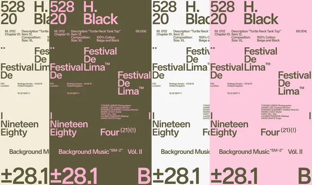
A multi-panel layout composition showing repeated Festival de Lima and type design variations in muted olive-green and soft pink colorways.
Summary
A horizontal composition showcasing multiple variations of Festival de Lima promotional layouts in two adjacent colorways—a warm olive-green palette and a soft pink palette. Each panel repeats branding, typography, and metadata in different arrangements.
Visual description
The image displays a grid-like study of festival promotional materials, divided vertically down the center into two color schemes. Left and center panels use warm olive-green and cream tones; right panels use soft pink and cream. Each panel repeats "Festival de Lima," event dates, ticket information, and typography in slightly varied arrangements, demonstrating the robustness of the design system across colorways. serif and sans-serif typefaces are mixed throughout.
Key takeaway
A comprehensive design system demonstration—showing how a core branding hierarchy remains legible and effective across multiple color variations, layouts, and informational densities. Useful for proving the flexibility of a type-driven system.
Reuse notes
Ideal reference for festival branding, design system documentation, poster design specifications, and color palette studies. The split-screen colorway approach is effective for pitch decks and brand guidelines showing adaptability.