Preview image. Unlock full-res
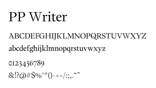
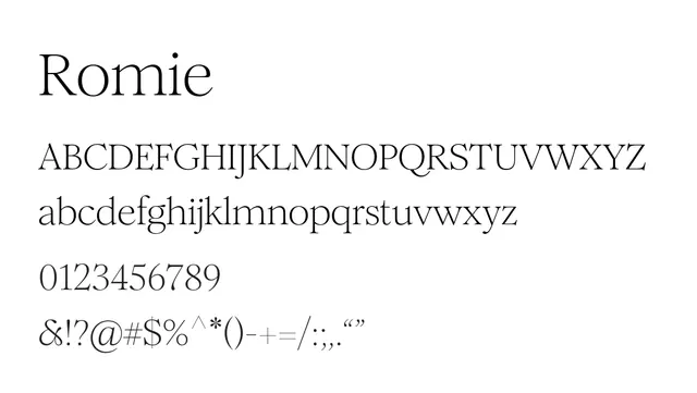
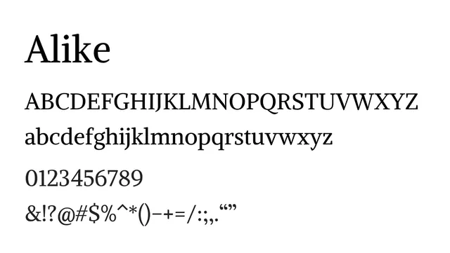
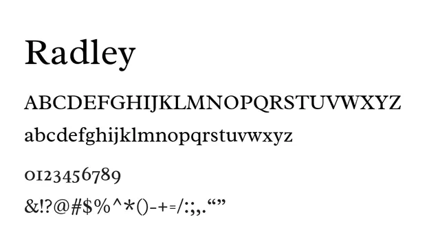
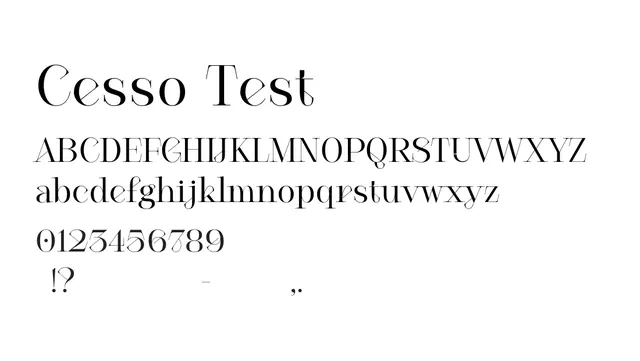
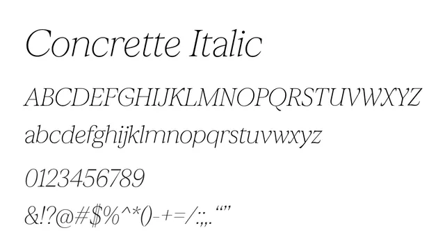
A thin, elegant italic serif with transitional features, ideal for sophisticated editorial typography and sophisticated body text.
Typeserif, transitional
Moodsophisticated, warm, editorial
Industryeditorial, publishing, fashion, luxury
Summary
A thin, elegant italic serif with transitional features, ideal for sophisticated editorial typography and sophisticated body text.
What to use it for
Excellent for editorial design, captions, pull quotes, and body text in luxury or fashion publications where elegance is paramount. The italic slant adds sophistication and visual rhythm.
Pairing
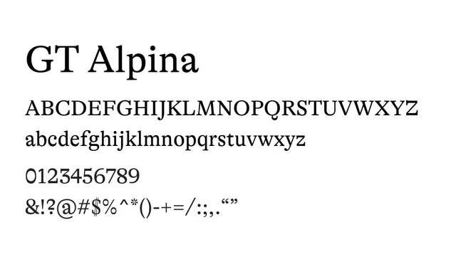
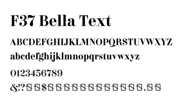
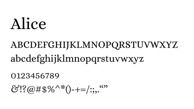
Pairs naturally with Concrette M or S (the roman weights) for a cohesive serif family, or with a geometric sans-serif like Futura for modern editorial layouts.