Preview image. Unlock full-res
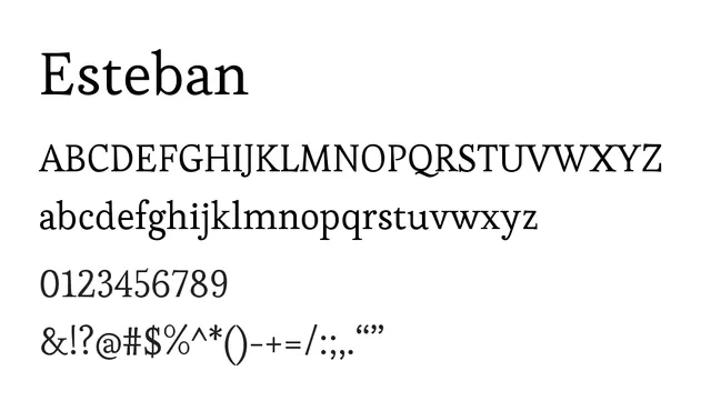
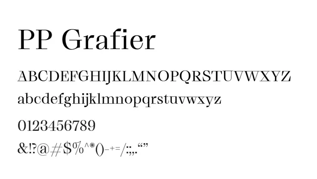
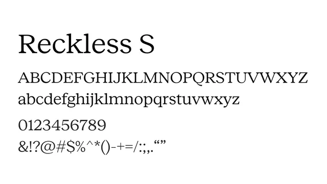
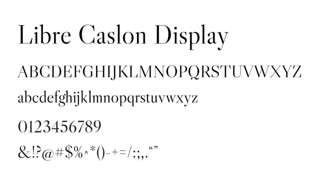
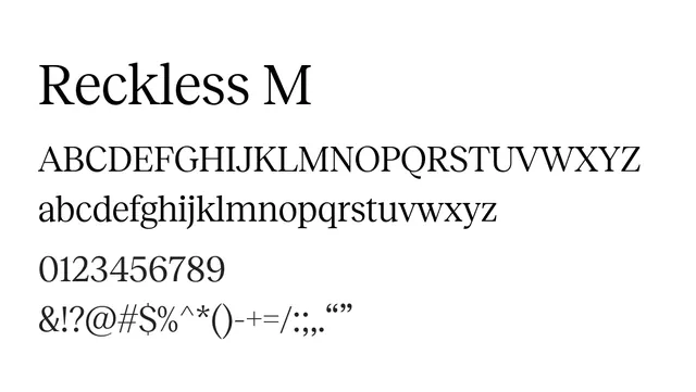
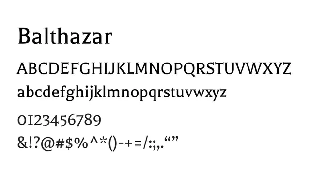
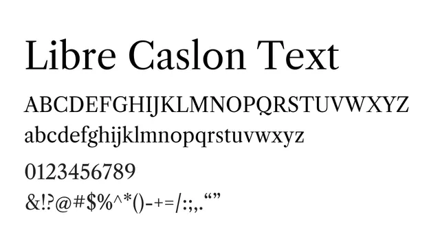
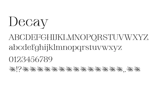
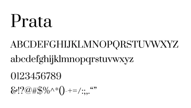
An elegant transitional serif with high x-height and moderate contrast, balancing classical beauty with modern readability.
Styleelegant, refined, classical, moderate-contrast
Typeserif, transitional
Moodsophisticated, warm, editorial, traditional
Industryeditorial, publishing, luxury, branding, fintech
Summary
An elegant transitional serif with high x-height and moderate contrast, balancing classical beauty with modern readability.
What to use it for
Prata works as both a display and body font in editorial design, luxury branding, and publishing where elegance without excess formality is valued.
Pairing
Pairs well with Inter or Montserrat for complementary sans-serif balance in contemporary layouts.