Preview image. Unlock full-res
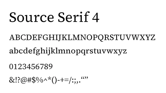
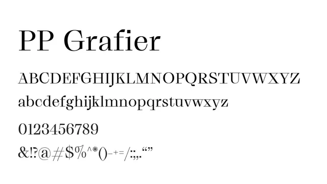
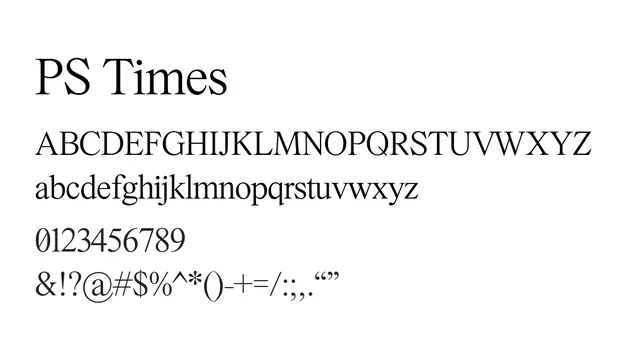
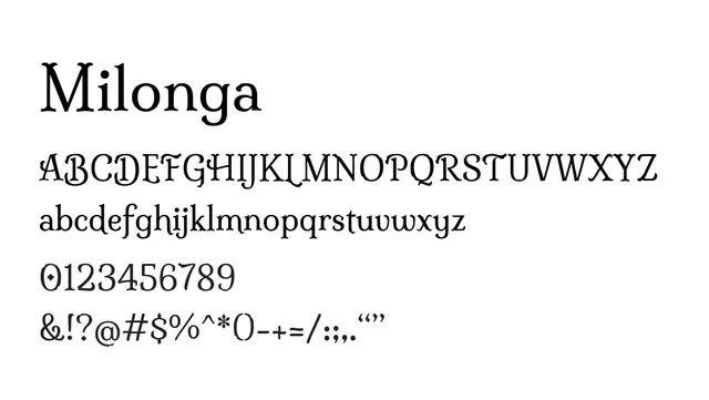
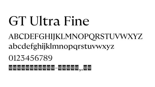
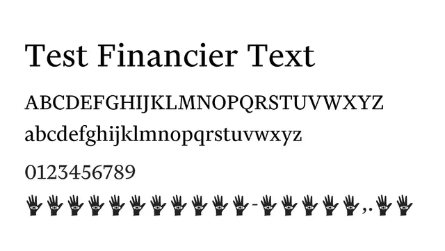
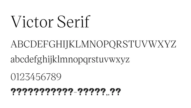
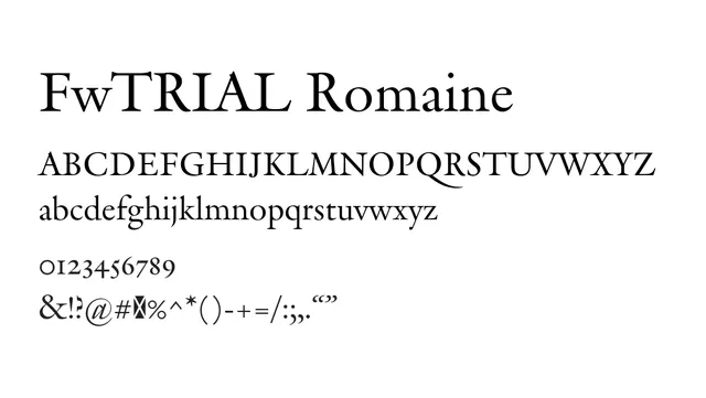
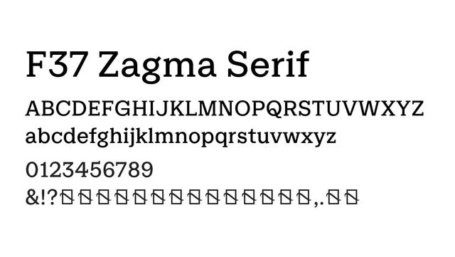
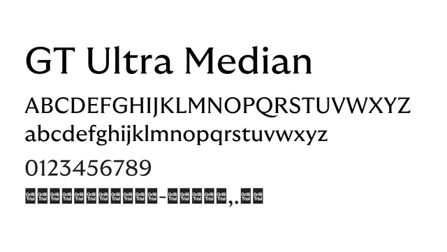
A balanced transitional serif with classical proportions and medium stroke contrast, versatile across body and display sizes.
Styleelegant, classical, professional, versatile
Moodsophisticated, formal, trustworthy, warm
Industryeditorial, publishing, luxury, corporate, academia
Summary
A balanced transitional serif with classical proportions and medium stroke contrast, versatile across body and display sizes.
What to use it for
Excellent for long-form editorial content, books, and magazines. Works well as a primary brand typeface for upmarket corporate and publishing industries. Reads beautifully in body text while maintaining elegance at larger sizes.
Pairing
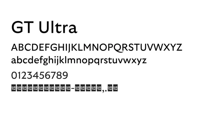
Complements GT Walsheim perfectly for a harmonious serif-sans pairing with consistent design language.