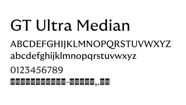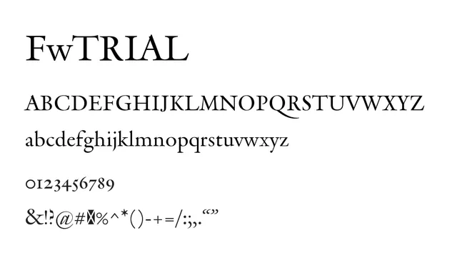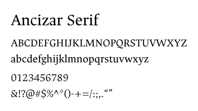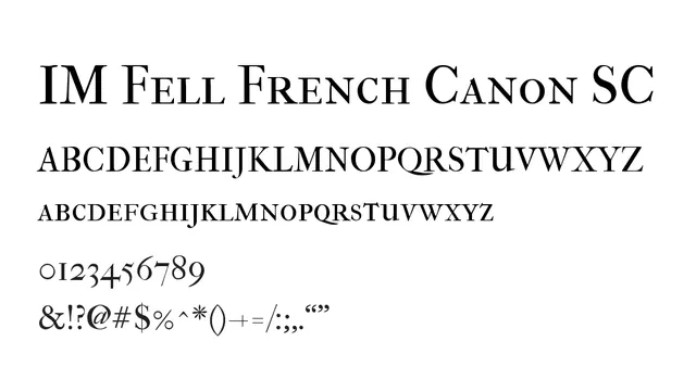
Preview image. Unlock full-res
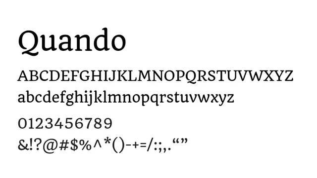
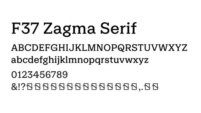
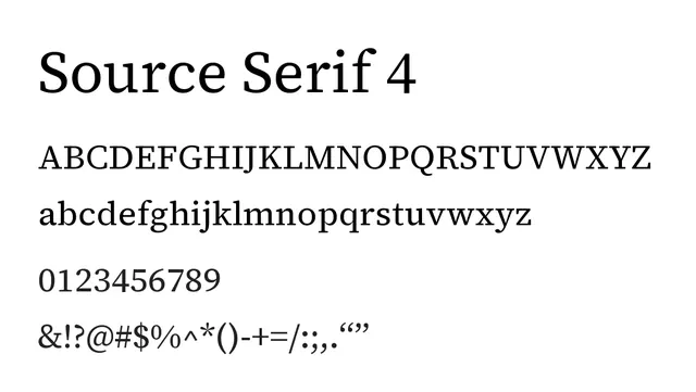
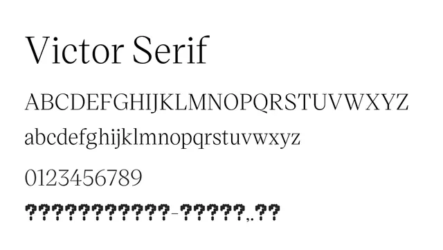
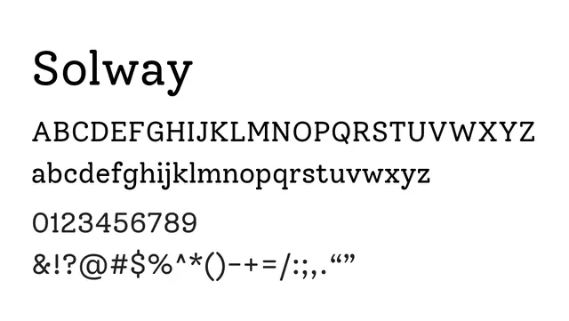
A refined transitional serif with balanced proportions and optimal readability across all sizes, from body text to display.
Styleelegant, classical, modern, professional
Moodsophisticated, formal, confident, refined
Summary
A refined transitional serif with balanced proportions and optimal readability across all sizes, from body text to display.
What to use it for
A workhorse typeface for sophisticated editorial and corporate applications. Perfect for book interiors, magazine layouts, and upmarket branding. Its extensive weight range supports everything from delicate captions to impactful headlines.
Pairing
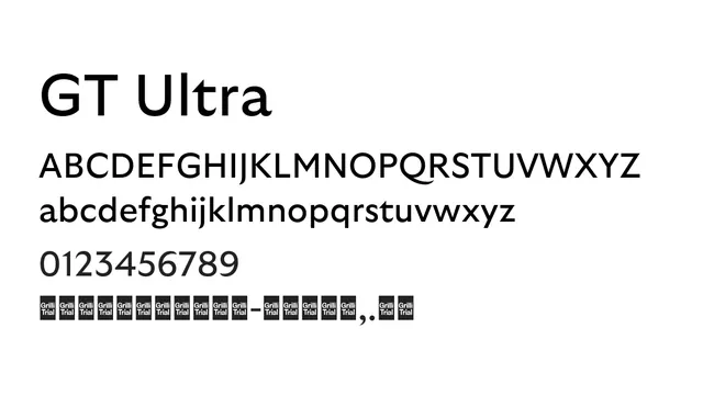
Harmonizes excellently with GT Walsheim, creating a cohesive brand system with balanced serif-sans hierarchy.