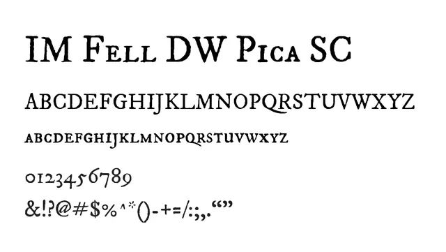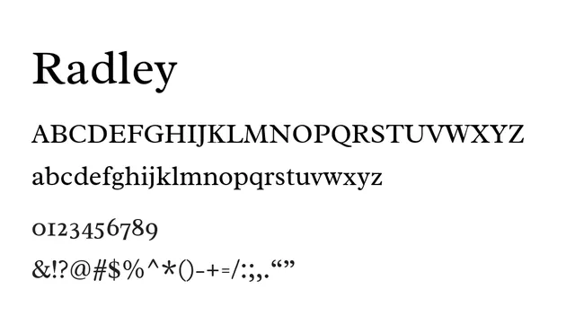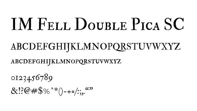
Preview image. Unlock full-res
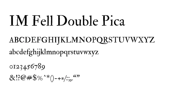
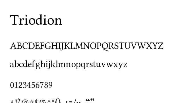
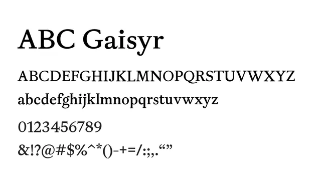
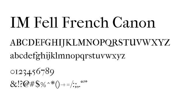
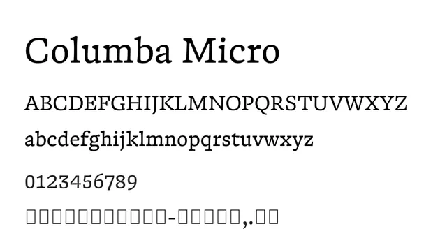
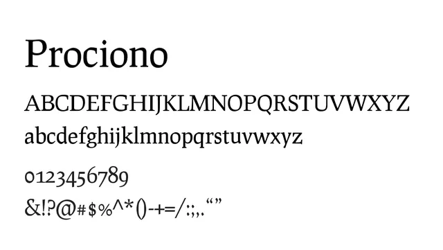
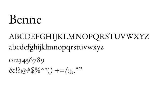
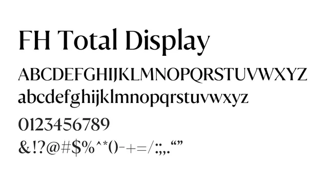
An elegant 18th-century inspired transitional serif with small caps, featuring high contrast and distinctive traditional letterforms.
Styleelegant, traditional, formal, high-contrast
Typeserif, transitional
Moodsophisticated, classical, refined, timeless
Industryeditorial, publishing, luxury, fine-art, heritage
Summary
An elegant 18th-century inspired transitional serif with small caps, featuring high contrast and distinctive traditional letterforms.
What to use it for
Best used for headlines, titles, and display purposes in editorial and luxury design. The small caps variant works particularly well for formal text and book design applications where traditional elegance is desired.
Pairing
Pairs beautifully with Garamond for editorial work or with a clean sans-serif like Gill Sans for contemporary contrast.