Preview image. Unlock full-res
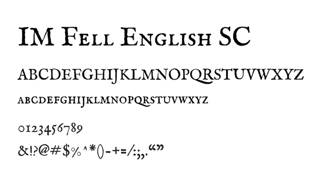
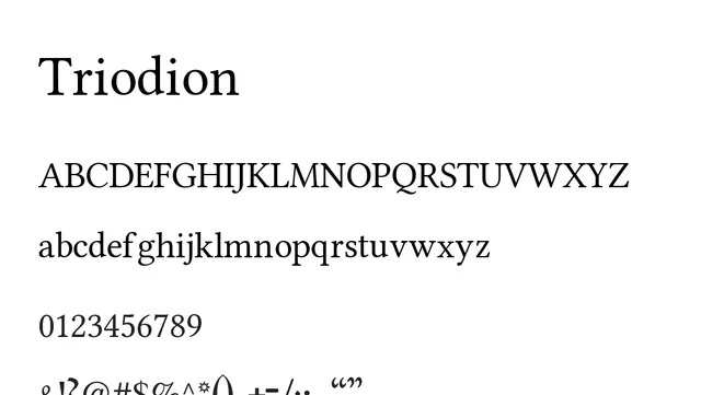
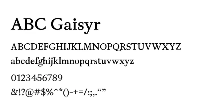
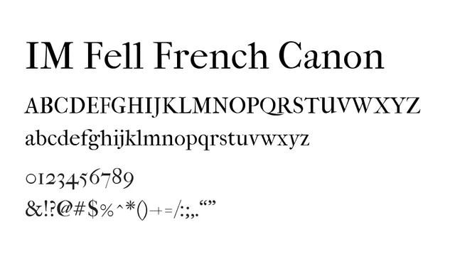
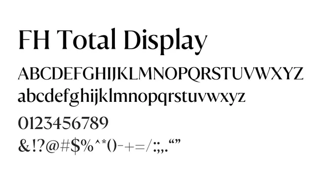
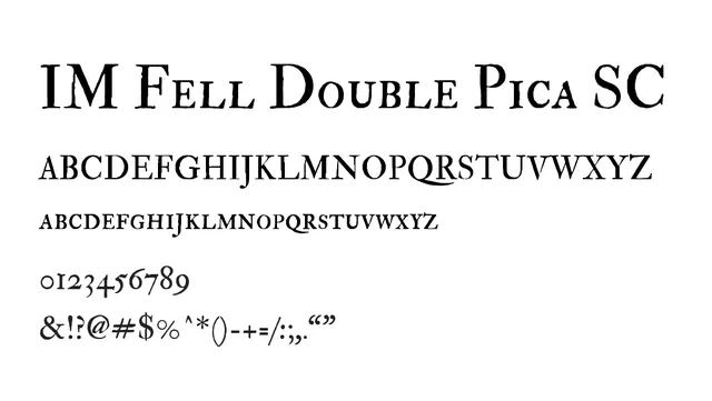
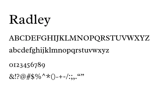
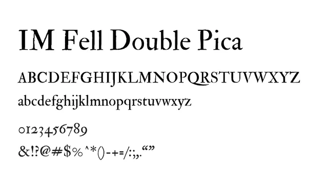
An elegant 18th-century inspired transitional serif with full character set, featuring high contrast and distinctive traditional letterforms.
Styleelegant, traditional, formal, high-contrast
Typeserif, transitional
Moodsophisticated, classical, refined, timeless
Industryeditorial, publishing, luxury, fine-art, heritage
Summary
An elegant 18th-century inspired transitional serif with full character set, featuring high contrast and distinctive traditional letterforms.
What to use it for
Excellent for display use and headlines in editorial, luxury, and heritage branding. The full lowercase set allows for more flexible typographic treatment while maintaining classical elegance and readability in longer passages.
Pairing
Complements well with humanist sans-serifs like Calibri or transitional serifs like Minion Pro for balanced classical typography.