Preview image. Unlock full-res
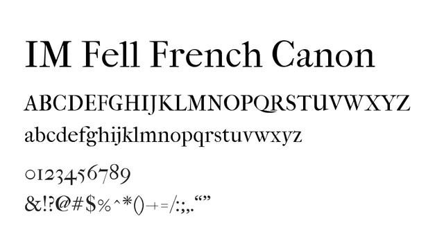
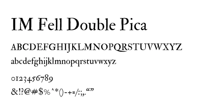
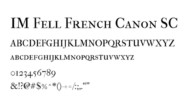
A high-contrast oldstyle serif in small caps only, evoking 18th-century printing with elegant bracketed serifs and refined letterforms.
Styleelegant, classical, traditional, high-contrast
Moodrefined, formal, historical, sophisticated
Industryeditorial, publishing, luxury, branding
Summary
A high-contrast oldstyle serif in small caps only, evoking 18th-century printing with elegant bracketed serifs and refined letterforms.
What to use it for
Perfect for formal headlines, book titles, and luxury branding that needs historical authenticity. The all-caps design makes it ideal for prestigious headlines but not body text.
Pairing
Pairs well with modern sans-serifs like Lato or Montserrat for editorial designs mixing classic and contemporary.