Preview image. Unlock full-res
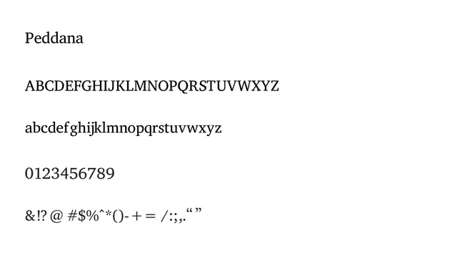
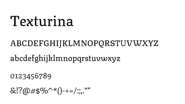
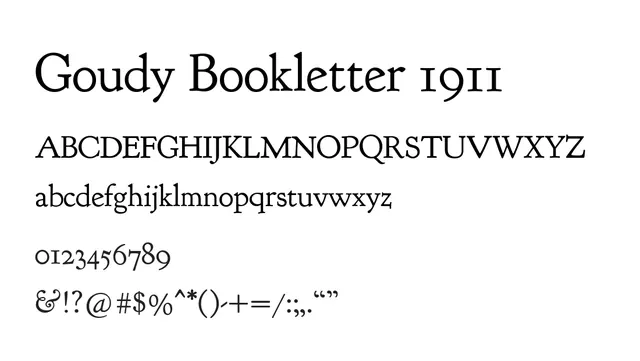
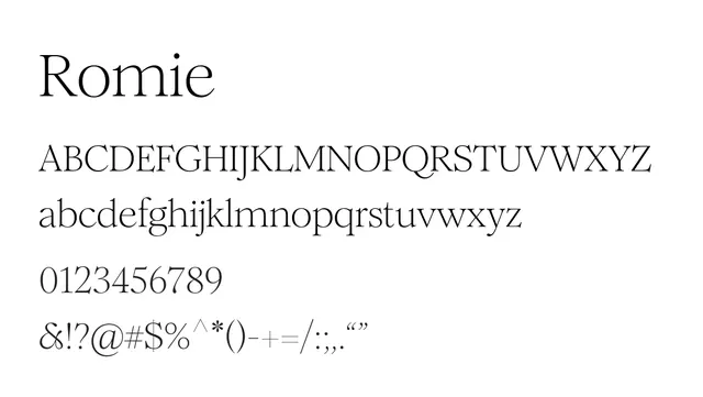
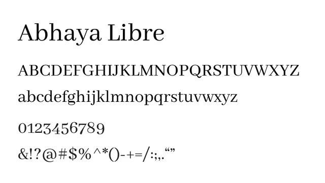
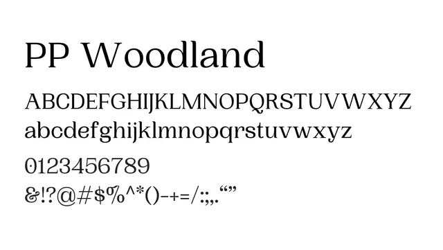
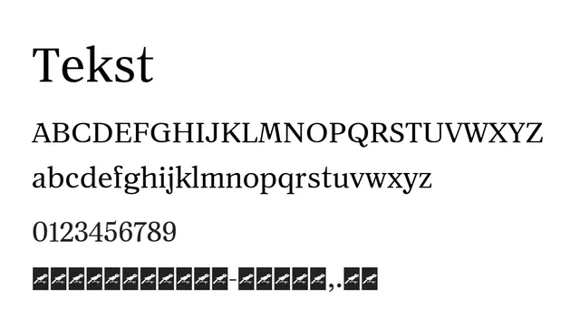
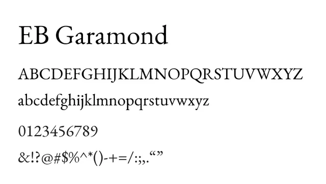
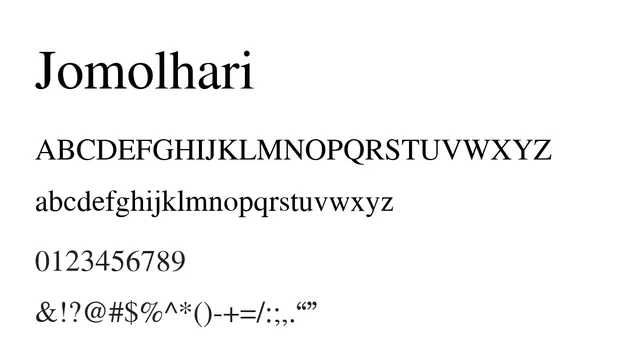
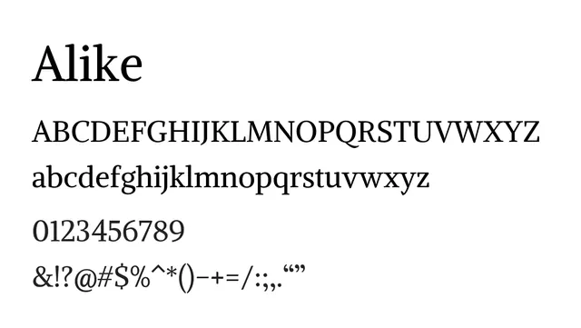
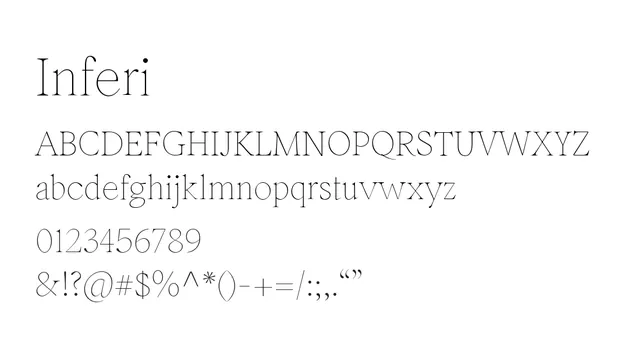
A warm, humanist serif with low contrast and graceful proportions ideal for elegant editorial design.
Styleelegant, classic, traditional
Moodwarm, sophisticated, literary
Industryeditorial, publishing, fashion, luxury
Summary
A warm, humanist serif with low contrast and graceful proportions ideal for elegant editorial design.
What to use it for
Excellent for long-form editorial content, book design, and sophisticated marketing where elegance and readability are paramount. The gentle x-height and warm character make it feel approachable yet refined.
Pairing
Pairs beautifully with a clean geometric sans like Helvetica Neue or Montserrat for contemporary contrast.