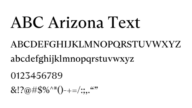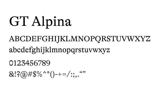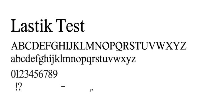
Preview image. Unlock full-res
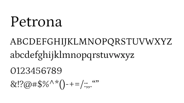
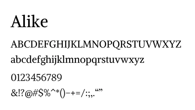
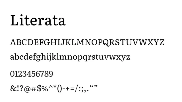
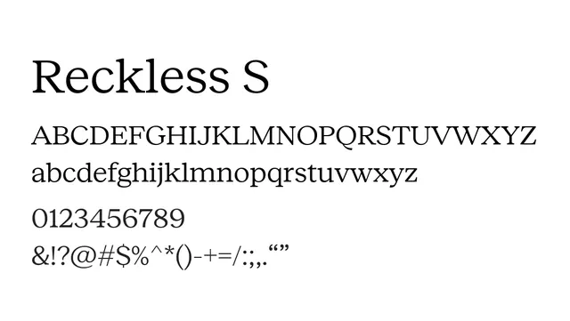
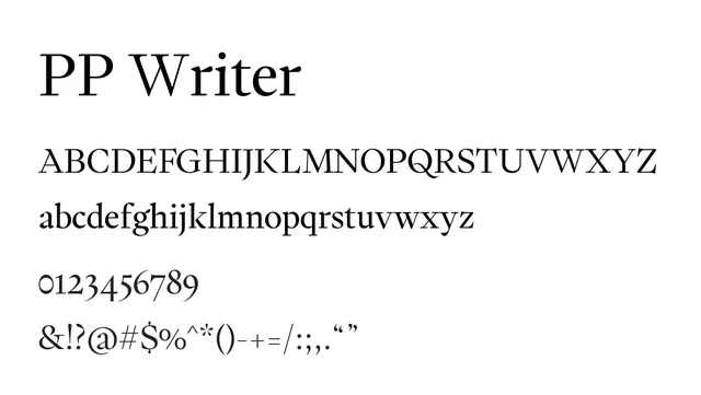
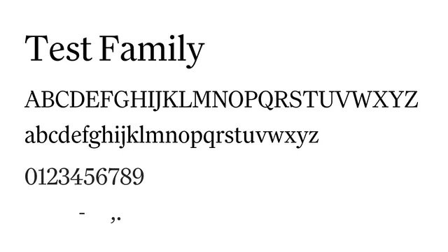
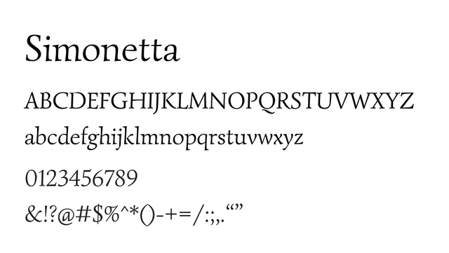
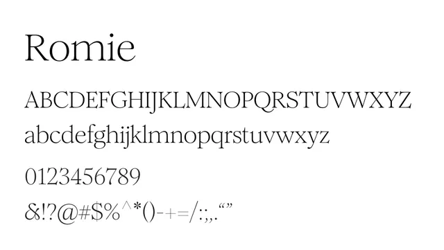
A refined transitional serif with elegant proportions, ideal for editorial and publishing contexts.
Moodwarm, sophisticated, traditional, literary
Industryeditorial, publishing, luxury, academia
Summary
A refined transitional serif with elegant proportions, ideal for editorial and publishing contexts.
What to use it for
Excellent choice for long-form body text in magazines and books. The moderate contrast and generous letterforms provide excellent readability at text sizes while maintaining editorial elegance.
Pairing
Pair with a clean neo-grotesque like Helvetica Neue or Avenir for editorial layouts with contrasting sans-serif headers.