Preview image. Unlock full-res
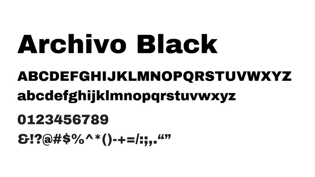
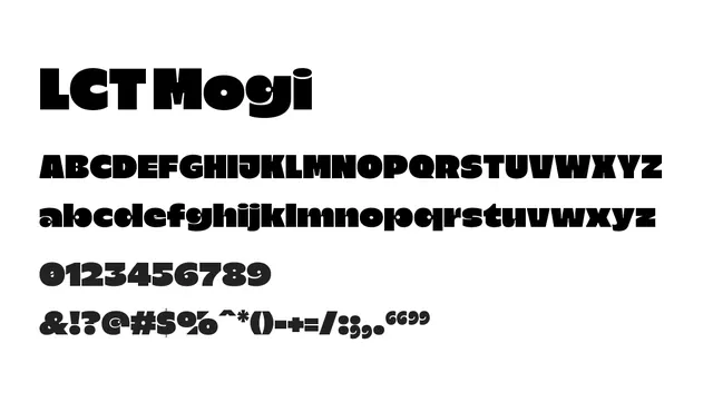
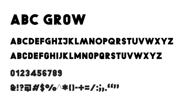
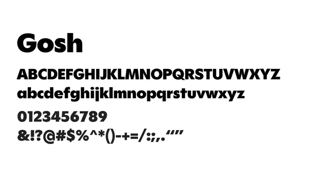
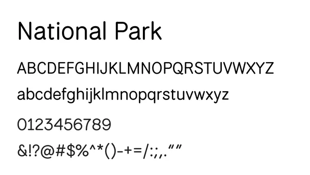
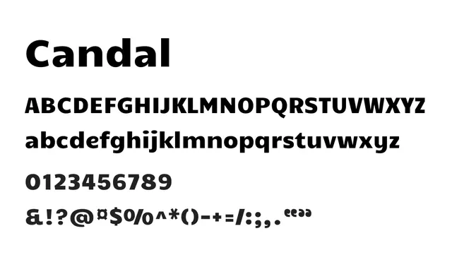
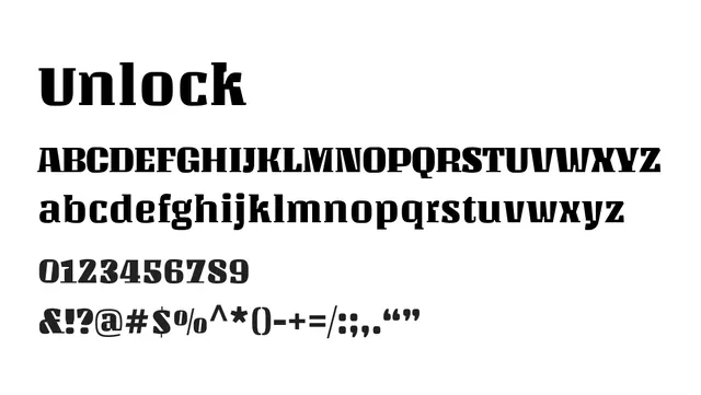
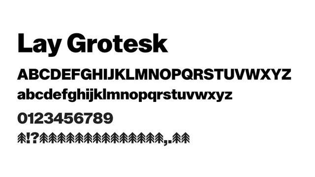
A bold grotesque sans-serif with striking letterforms, designed for powerful display use and headlines.
Moodpowerful, modern, direct, aggressive
Industryeditorial, advertising, branding, fashion
Summary
A bold grotesque sans-serif with striking letterforms, designed for powerful display use and headlines.
What to use it for
Best used for headlines and display sizes. The high contrast and bold weights create strong visual impact in editorial and advertising contexts. Not recommended for extended body text due to its commanding presence.
Pairing
Pair with a neutral humanist sans like Oxygen or Lato for text/body to balance the display power with reading comfort.