Preview image. Unlock full-res
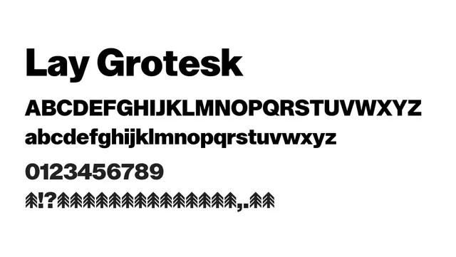
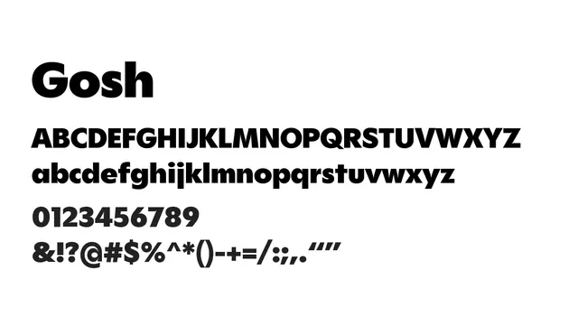
A bold, geometrically-proportioned grotesque with substantial weight and powerful presence. Excellent for headlines and branding.
Stylebold, strong, confident, versatile, structured
Moodprofessional, powerful, modern, neutral, authoritative
Summary
A bold, geometrically-proportioned grotesque with substantial weight and powerful presence. Excellent for headlines and branding.
What to use it for
The regular and heavier weights work superbly for headlines, titles, and branding applications. The extensive weight range (Thin through Black) provides versatility across headlines and emphasis. Not optimal for body text due to moderate x-height and weight distribution.
Pairing
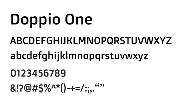
Pair with a lighter sans like Mona Sans or Source Sans for body text, or with a serif like Lyon for editorial elegance.