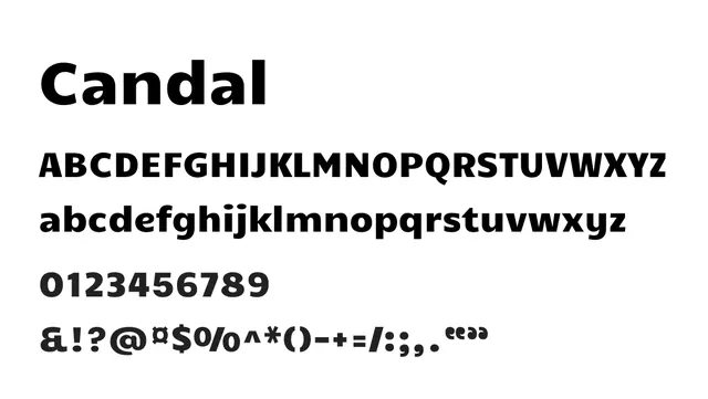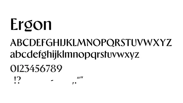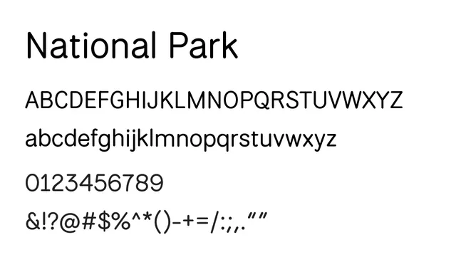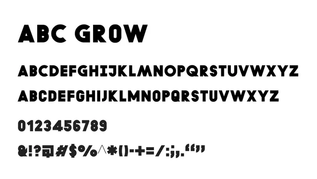
Preview image. Unlock full-res

What to use it for
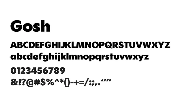
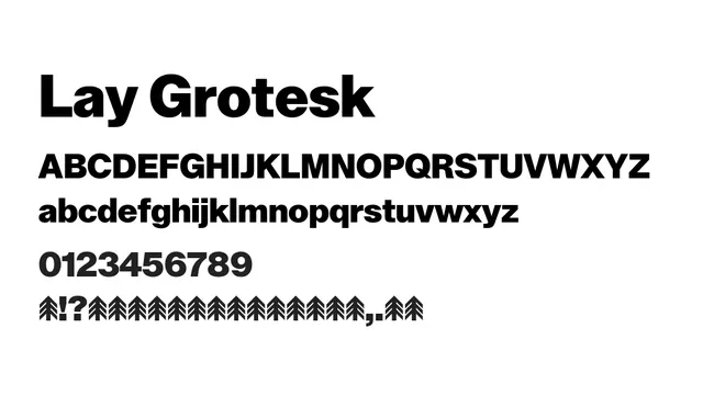
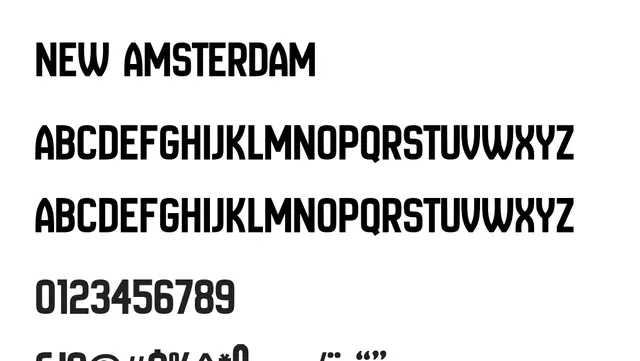
Best suited for headlines, large display text, and branding applications where impact and strength are needed. Not recommended for body text due to its extreme weight and display-oriented design.
Pairing
Pairs well with a lighter geometric sans like Helvetica Neue Light or a humanist sans like Calibre Light for contrast in display layouts.
TypeSans Serif, Grotesque
IndustryBranding, Headlines, Signage, Editorial, Advertising