Preview image. Unlock full-res
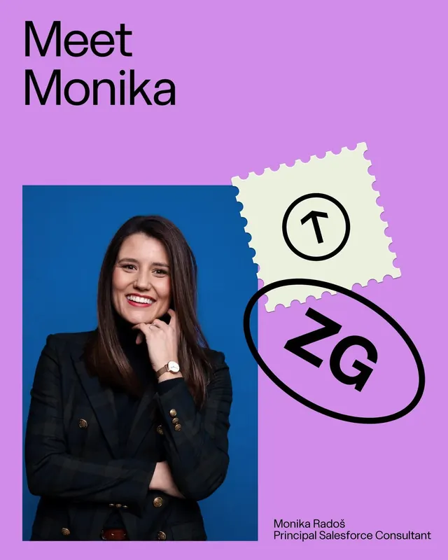
A recruiter profile card for Monika featuring a professional headshot on a deep-teal background on the left, paired with a vibrant orchid-purple right side containing hand-drawn geometric badges and playful typography.
Summary
A recruiter profile card for Monika featuring a professional headshot on a deep-teal background on the left, paired with a vibrant orchid-purple right side containing hand-drawn geometric badges and playful typography.
Visual description
Left half: a professional portrait of Monika in a dark double-breasted blazer with gold buttons, shot against a deep-teal background, her direct gaze and hand-to-chin pose conveying confidence and approachability. Right half: vivid orchid-purple serving as backdrop for hand-drawn graphic elements: a cream-colored stamp-like square with a circled "T", and a black-outlined oval containing bold "2Q" lettering. Top of the entire card reads "Meet Monika" in large, bold sans-serif. Bottom right in smaller type: name, title "Principal Salesforce Consultant". The split-color layout (teal portrait left, purple graphic right) creates visual tension and movement. All elements remain clean and legible despite the playful hand-drawn borders.
Key takeaway
The combination of a serious, professional portrait with whimsical geometric and badge-like graphic elements signals that the person is both credible and approachable. The split color-field composition (two dominant hues, sharply divided) is an efficient way to create visual interest and guide the eye from portrait to credentials. Hand-drawn borders on geometric shapes add a human, creative touch to an otherwise corporate format.
Reuse notes
Strong template for recruiting, consulting, or professional-services team introductions. Balances authority (formal portrait, corporate title) with warmth (playful shapes, colorful background). The high-contrast palette is memorable in small sizes (email, web thumbnail). Best suited to client-facing roles where approachability matters as much as expertise. The purple-teal combination reads as contemporary and tech-forward; avoid if brand guidelines require more conservative color.
More like this



Keep what you find
A free account saves references to boards and can send you a weekly email of picks based on what you save.
To see every result, go Pro.