Preview image. Unlock full-res
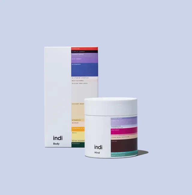
Coordinated skincare packaging using stacked color strips to distinguish product variants while maintaining minimalist presentation and cohesive branding.
Summary
Modular skincare product line with stacked horizontal color bands differentiating variants across box and jar formats, anchored by minimal sans-serif logotype.
Visual description
Three-product arrangement shown against pale purple-gray background: left, a tall rectangular box with narrow horizontal color stripes (lavender, deep purple, navy, gold, muted green) stacked vertically above a small wordmark "indi"; center, a white cylindrical jar with the same color-stripe system wrapped around its mid-section, angled to show depth; right, a smaller rectangular box repeating the striped motif. Each stripe represents a distinct product type or scent. The palette is cool and restrained—no imagery or decoration, only typography and chromatic ordering for hierarchy and differentiation.
Key takeaway
The stacked-stripe technique as a reusable system for multi-SKU product lines. Each color band is immediately readable and creates visual rhythm without added graphics. The balance of crisp geometry (boxes) with organic form (jar) reads as both modern and approachable, suitable for premium wellness branding.
Reuse notes
Works for skincare, cosmetics, or any modular product family needing SKU differentiation and shelf presence. The soft, cool palette reads premium and health-conscious; apply warmer tones or higher contrast for bolder positioning. Requires genuine product shapes to carry the visual weight.
More like this


Keep what you find
A free account saves references to boards and can send you a weekly email of picks based on what you save.
To see every result, go Pro.