Preview image. Unlock full-res
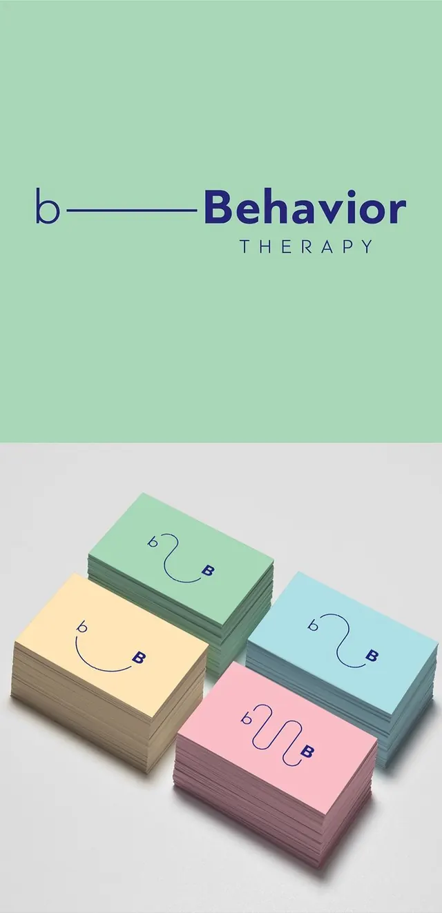
Pastel multi-color branding system for a mental health service, combining a minimal logotype with stacked business-card mockups in soft greens, yellows, blues, and pinks.
Summary
A complete identity system for a behavioral therapy brand, showcasing a minimal logotype paired with a modular system of business-card mockups in a soft, pastel palette.
Visual description
The top half features a horizontal logo composition with a lowercase italic 'b' (in navy) connected to the word "Behavior" in oversized sans-serif capitals, with "THERAPY" set in small caps below. A mint-green background extends across the full width. The lower half displays four stacked business-card mockups arranged in an isometric 3D perspective: mint green, pale yellow, light blue, and blush pink cards, each printed with a curved line motif and the brand's 'b' symbol. Soft neutral background. The palette stays consistent and restful across all elements.
Key takeaway
The discipline of a single, scalable symbol (the 'b') repeated across all touchpoints; the smart use of soft, analogous pastels to convey calm without feeling juvenile; the 3D card mockup as a compact way to show material and color variation in a single frame.
Reuse notes
Ideal for healthcare, therapy, wellness, or mental-health brands seeking a modern, approachable identity. The pastel palette and gentle line work signal emotional safety; the italic serif 'b' adds sophistication. Works well for digital + print campaigns, and the modular card system is easy to adapt to other collateral (letterhead, envelope, web).
More like this



Keep what you find
A free account saves references to boards and can send you a weekly email of picks based on what you save.
To see every result, go Pro.