Preview image. Unlock full-res
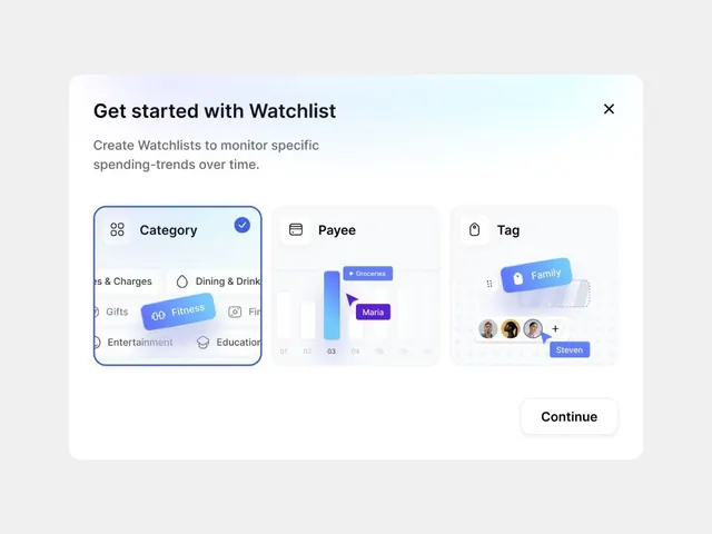
Card-based onboarding modal for a financial app with three selectable tabs (Category, Payee, Tag) using pastel blue accents and illustrative icons to guide spending-tracking setup.
Summary
Onboarding modal for a personal finance app presenting three tabbed selection options (Category, Payee, Tag) with pastel-blue filled buttons and illustrative icons, letting users choose how to organize their spending tracker.
Visual description
A white modal dialog on a light gray background. Header: black sans-serif heading "Get started with Watchlist" with close icon top right. Subheading explains the feature in gray text. Three card tabs below: the active "Category" tab has a blue border and checkmark, listing spending categories (Groceries, Dining, Fitness, Entertainment) with icons. The "Payee" tab shows a stacked bar chart with purple labels (Groceries, Maria). The "Tag" tab displays user avatars and a blue button label (Family, Steven). A large "Continue" button anchors the bottom. Pastel blue (#7B87BE, #ACBFD8) is used consistently for active states and accent buttons.
Key takeaway
Three-tab onboarding that breaks setup into focused choice categories rather than one overwhelming form. Subtle icon pairing with text makes each option scannable at a glance.
Reuse notes
Excellent pattern for fintech apps and multi-step onboarding. The tab layout works best when each option is truly distinct. The pastel blue palette feels approachable for personal finance, avoiding the stern corporate blues that dominate the category.
More like this



Keep what you find
A free account saves references to boards and can send you a weekly email of picks based on what you save.
To see every result, go Pro.