Preview image. Unlock full-res
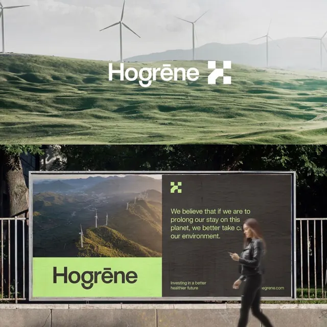
Outdoor billboard pairing a sweeping wind-turbine landscape photograph with a dark panel containing messaging and a neon-lime brand mark.
Summary
Outdoor billboard dividing landscape photography (upper) and messaging panel (lower), with a bright neon-lime brand mark as the sole accent color.
Visual description
Large outdoor billboard mounted on a railing. Upper half: wide-angle photograph of rolling green hills dotted with wind turbines and overcast sky, establishing the environmental narrative. Lower half: dark charcoal panel split into two zones. Left: color photograph of a distant hillside with more turbines. Right: white sans-serif body text ("We believe that if we are to prolong our stay on this planet, we better take care of our environment"), small neon-lime square mark with the "Hogrene" logo, and a website URL. The bold lime accent is the only color break; the rest is muted earth tones, whites, and dark greys. A person walking past the billboard in real time shows scale and everyday context.
Key takeaway
Using a single neon accent color strategically in an otherwise muted palette creates immediate visual impact without disrupting the serious, environmental tone. The split composition (photograph above, messaging below) is an economical way to anchor a landscape-based narrative while keeping copy contained. The brand mark's geometric simplicity (a lime square) reads as modern and trustworthy against the muted backdrop.
Reuse notes
Effective for energy, sustainability, or B2B companies targeting environmentally conscious audiences. Works especially well for outdoor/large-scale applications where the image quality and negative space can breathe. The palette choice (muted + one bright pop) suits brands positioning as responsible stewards. Text placement in the bottom third keeps the focal landscape uncluttered. Avoid if the brand voice needs warmth; this approach reads formal and mission-driven.
More like this



Keep what you find
A free account saves references to boards and can send you a weekly email of picks based on what you save.
To see every result, go Pro.