Preview image. Unlock full-res
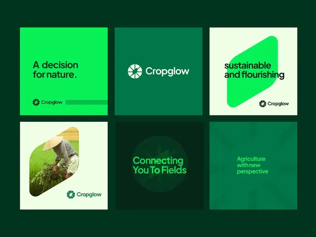
Agritech brand identity using a 3x2 grid of messaging cards in lime and teal greens with bold sans-serif headlines, logo lockups, and one integrated crop photograph.
Summary
Agritech brand identity system using a six-card grid layout in bright lime and teal greens to communicate a sustainability-first farming narrative, with bold headlines and one integrated crop photograph.
Visual description
Very dark forest-green background containing a 3x2 grid of equal rectangular cards. Top-left card: lime green with bold headline "A decision for nature." and Cropglow logo. Top-center: darker teal card with centered Cropglow logo and wordmark only. Top-right: cream card with a lime curved blob shape overlaid, headline "sustainable and flourishing", Cropglow logo. Bottom-left: cream background with a cropped photograph of a farmer in a rice/crop field wearing a straw hat, positioned off-center, Cropglow logo bottom. Bottom-center: dark teal card, centered headline in bright lime "Connecting You To Fields". Bottom-right: solid dark teal card with lime text "Agriculture with new perspective". All typography is bold, modern sans-serif in varying sizes. No decorative elements except the one curved blob shape and the photographic integration.
Key takeaway
The six-card grid is modular and flexible, allowing mix-and-match of solid color, messaging, logo, and photographic cards. The limited, high-contrast color palette (three shades of green plus cream) stays cohesive across all variations. Large, single-line headlines in all-caps or title case read immediately even in small views. Embedding real agricultural photography in one card grounds the abstract brand system in actual farming context. The layout works as a printed poster, a web component, or a social-media card system.
Reuse notes
Best for B2B agritech, food, or sustainability brands with a young, forward-facing tone. The bright lime and teal feel modern and tech-forward while the green palette signals environmental responsibility. Works at multiple scales (billboard, web, mobile, social). The modular card structure allows content teams to swap messaging, rotate imagery, or scale the grid (2x3, 4x2, etc.) without redesign. The absence of shadows or gradients keeps it printable and accessible.
More like this







Keep what you find
A free account saves references to boards and can send you a weekly email of picks based on what you save.
To see every result, go Pro.