Preview image. Unlock full-res
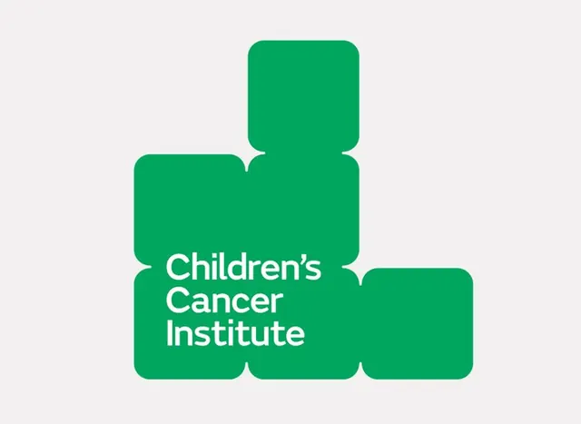
Modular teal rounded-square logo system for Children's Cancer Institute, composed of interlocking blocks that form a scalable, flexible mark on light gray background.
Summary
Adaptive modular logo mark built from interlocking teal rounded rectangles that spell out the institution's name, exemplifying flexibility and systemic thinking in healthcare branding.
Visual description
A teal rounded-rectangle form composed of six interlocking blocks arranged in a cross-like pattern, with subtle notches where blocks meet. The shapes stack vertically at center (two blocks) and horizontally on left and right, creating a plus-sign silhouette. White uppercase sans-serif text "Children's Cancer Institute" overlays the center stack. The mark sits centered on a soft light-gray background. The single teal color (#00A65E / #57BF92 tints) with rounded corners creates an approachable, non-threatening visual character.
Key takeaway
The modular block system that can be deconstructed and recombined for different applications (horizontal, vertical, single block) while maintaining recognizability. The rounded corners soften what could be rigid geometry, making the institutional mark feel warm and hopeful. The use of a single color removes technical and cost barriers for application across small-scale and large-scale media.
Reuse notes
Ideal for healthcare, nonprofit, and educational institutions that need to express both professional credibility and human compassion. The modularity means it adapts well to square favicons, horizontal lockups, social avatars, and print applications. Works best on light or white backgrounds; simplicity means it may disappear on busy compositions. The softly rounded geometry reads as contemporary and accessible to diverse audiences.
More like this






Keep what you find
A free account saves references to boards and can send you a weekly email of picks based on what you save.
To see every result, go Pro.