Preview image. Unlock full-res
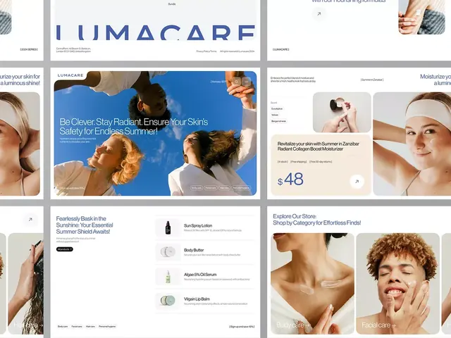
Modular grid of product hero sections, detail cards, and category browse pages for Lumacare skincare brand with product photography and pricing.
Summary
A modular e-commerce layout for Lumacare skincare brand showing hero sections with product photography, category card grids, pricing displays, and featured product modules across desktop breakpoints.
Visual description
A multi-frame mockup of the Lumacare skincare site showing six distinct page sections at varying scales against a soft gray background. The hero section occupies the largest frame with a vibrant blue background, a lifestyle product photograph (person with sunscreen), and white sans-serif headline about summer sun protection. Smaller frames show product detail cards with close-up photography (hands, face), category browse modules ("Body care", "Facial care"), and ingredient/product showcases ("Sun Spray Lotion", "Body Butter", "Algae 5% Oil Serum"). The color palette stays neutral (white, natural skin tones, dark gray) except for the bright blue accent in the hero. Typography is sans-serif throughout, set in a high-contrast white or dark gray. Generous white space surrounds each module. Prices and calls-to-action appear in discrete locations.
Key takeaway
The modular grid layout that maintains visual hierarchy across multiple product and category frames. The restraint of using a single accent color (bright blue) against a predominantly neutral palette. The combination of lifestyle and product photography in a single view. The spacing and alignment discipline that makes the layout feel premium despite density.
Reuse notes
Strong template for beauty, skincare, or wellness e-commerce where product photography is high-quality and ingredient transparency matters. The neutral palette pairs well with lifestyle imagery. Works for multi-category retail (body, facial, supplements). Avoid overloading the blue accent; use sparingly for CTAs or hero sections only.
More like this






Keep what you find
A free account saves references to boards and can send you a weekly email of picks based on what you save.
To see every result, go Pro.