Preview image. Unlock full-res
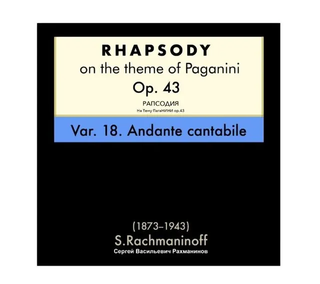
A formal sheet-music cover with centered typography in stacked layout on a stark black background, classical serif serif headers and bilingual subtitles.
Summary
A formal sheet-music cover for Rachmaninoff's Rhapsody on Paganini Op. 43, centered in a stacked layout with black ground and cream/white inset bands framing the typography.
Visual description
A stark black background with a cream-colored rectangular inset band at the top containing the work title in large all-caps serif: "RHAPSODY" followed by "on the theme of Paganini Op. 43" in smaller type, then Cyrillic text (transliterated title and opus). Below that, a narrow bright-blue horizontal band reads "Var. 18. Andante cantabile" in a serif face. At the bottom of the black field, white serif text displays composer information: dates "(1873-1943)" above "S. Rachmaninoff" and the Cyrillic name. The overall effect is stark, dignified, and evocative of early 20th-century European music publishing.
Key takeaway
The restraint of color (pure black, cream, bright blue, white) and the formal framing device (the cream inset as a containing band) create authority and legibility. The bilingual/transliterated text treatment—small but present—is thorough without cluttering. The narrow accent band of color punctuates the composition and draws the eye.
Reuse notes
Excellent reference for classical music identities, academic/institutional publishing, and any work requiring formality and historical weight. The stark contrast and serif type work best in print or large-format digital contexts. Avoid if brightness or friendliness is the goal.
More like this







Keep what you find
A free account saves references to boards and can send you a weekly email of picks based on what you save.
To see every result, go Pro.