Preview image. Unlock full-res
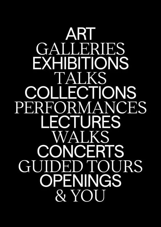
Centered all-caps list of cultural activities in white sans-serif on pure black, each phrase stacked as its own line.
Summary
A centered stack of cultural activities (galleries, exhibitions, talks, performances, lectures) set in all-caps sans-serif on solid black, announcing a venue's programming in stark typographic form.
Visual description
Pure black background fills the frame. A centered list of activities runs vertically in white, all-caps sans-serif: "ART", "GALLERIES", "EXHIBITIONS", "TALKS", "COLLECTIONS", "PERFORMANCES", "LECTURES", "WALKS", "CONCERTS", "GUIDED TOURS", "OPENINGS", "& YOU". Each phrase sits on its own line, with consistent weight and generous vertical spacing between items. The typeface is geometric and modern, with even stroke weight and minimal serifs. No color, no secondary imagery.
Key takeaway
The confidence of white typography alone on black to carry institutional or cultural messaging without decoration. The generous stacked spacing makes each activity read as equally weighted and important. Centered column layout with consistent typeface weight creates an authoritative, gallery-ready aesthetic.
Reuse notes
Strong for arts institutions, museum programming, cultural venues, or any organization listing services or offerings. The high contrast and centered approach work well on walls, digital screens, or print materials where clarity and formality matter. Best suited for cultures and organizations wanting an editorial, gallery-like tone. Add any color accent and the minimalism breaks; keep this stark.
More like this


Keep what you find
A free account saves references to boards and can send you a weekly email of picks based on what you save.
To see every result, go Pro.