Preview image. Unlock full-res
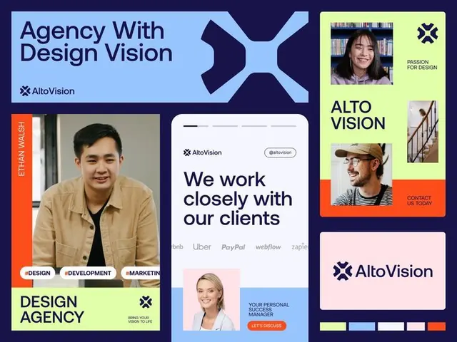
Design agency branding suite combining navy, lime, and coral color blocks with portraits, client logos, and geometric logo mark.
Summary
Design agency branding suite combining navy, lime, and coral color blocks with portraits, client logos, and geometric logo mark.
Visual description
A multi-frame branding presentation for AltoVision, a design agency. Navy background with modular color blocks (lime green, coral orange, light blue, pale pink) containing: top-left, a light-blue block with oversized headline "Agency With Design Vision" and the AltoVision X-shaped mark; center-left, a coral sidebar labeled "ETHAN WALSH" with a portrait photo and three topic badges (DESIGN, DEVELOPMENT, MARKETING); center, a card-style frame showing headline "We work closely with our clients" with client logos (Airbnb, Uber, PayPal, Webflow, Zapier) and two portrait photos below; right side, a lime-green vertical panel with another portrait and "PASSION FOR DESIGN" text, stacked photography, and contact prompt; bottom-center, a pale pink card with just the AltoVision logo. Geometric X-mark used as consistent brand element throughout. All photography shows diverse team members. Heavy geometric shapes and strict grid-based layout with 2-3 point color palette.
Key takeaway
The high-contrast color blocking (navy + lime + coral) creates immediate visual pop and clearly separates information zones without fussy borders. The repeating X-shaped logo mark ties the fragmented composition together. Client logo integration above face-level hierarchy signals credibility and partnership scale.
Reuse notes
Strong template for design studios, consultancies, and creative services portfolios. The bold color contrast works best when the brand has a distinct primary + secondary + accent system. Works well when you have portrait photography and want to show team personality. Avoid if your brand is monochrome or pastel only.
More like this






Keep what you find
A free account saves references to boards and can send you a weekly email of picks based on what you save.
To see every result, go Pro.