Preview image. Unlock full-res
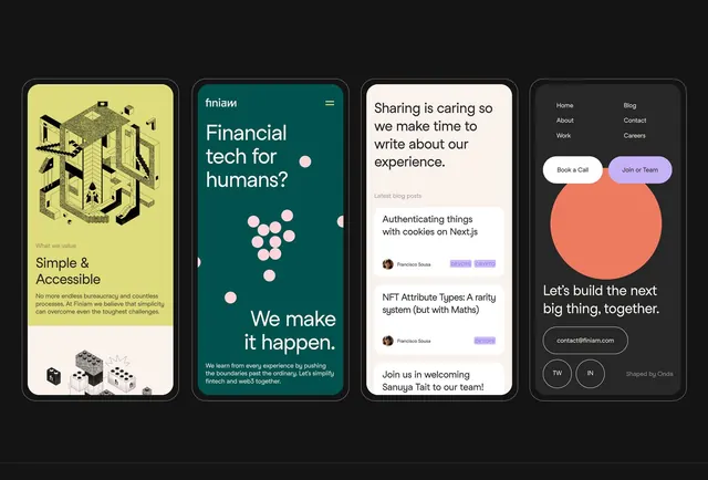
A grid of four branded interface cards showcasing cohesive design systems across fintech, blog, developer, and recruitment contexts using teal, yellow, and warm accent palettes.
Summary
A grid of four rounded-corner interface cards demonstrating distinct brand identities: a fintech platform with isometric illustrations and yellow accents, a teal fintech hero with large headline and floating circles, a light blog UI with author avatars and tag badges, and a dark developer site with coral circle element and social links.
Visual description
Four vertically oriented cards arranged horizontally on a dark background. Card 1 (left, yellow background) shows isometric building and machinery illustrations with heading "Simple & Accessible" and supporting text, plus small white icon badges at the bottom. Card 2 (teal) features large headline "Financial tech for humans?" with pink circular decorative elements and footer text. Card 3 (light cream/white) displays blog content with headline "Sharing is caring so we make time to write about our experience", a large orange circle below, latest blog post snippets, and author avatars with colored tag badges. Card 4 (dark gray) shows a large coral circle with white sans-serif headline, contact email, social icon buttons, and footer credit. All cards share consistent radius and border treatment. Sans-serif typography throughout with clean hierarchy.
Key takeaway
The card-based grid system creates modular brand showcases that can scale to multiple contexts. The use of one dominant accent color per card (yellow, pink, coral, teal) while maintaining the dark outer background creates coherence and contrast. The mix of isometric/illustrative elements with clean typography and functional UI (buttons, forms, badges) shows how to blend playful and professional in a single layout.
Reuse notes
Strong reference for fintech, SaaS, developer-tool, or multi-product brand decks. Useful when you need to show multiple brand expressions at once. Works well as a marketing or pitch asset. The card proportions are tall/mobile-friendly, suggesting web or app showcase context. Pairs well with projects needing cohesive color systems with distinct per-brand accents.
More like this

Keep what you find
A free account saves references to boards and can send you a weekly email of picks based on what you save.
To see every result, go Pro.