Preview image. Unlock full-res
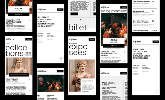
A grid of printed event tickets and information cards bound by thick black borders, mixing cream cardstock with high-contrast typography and gold accents.
Summary
A grid of printed event tickets and information cards bound by thick black borders, mixing cream cardstock with high-contrast typography and gold accents.
Visual description
The composition is a dense collage of cream and off-white printed cards framed individually by thick black borders, arranged in a loose grid. Some cards feature portrait photography; others are text-only with hierarchical typography in black and warm tan/gold. Visible type includes "BILLET" (minimalist), "EXPO" (large display serif), event details, dates, and institutional information. Sans-serif body text is paired with occasional display serifs for emphasis. The tight black frames create visual compartmentalization, while the limited palette of cream, black, and muted gold ties the system together. The overall effect is institutional and curatorial, evoking museum or gallery event materials.
Key takeaway
The thick black border as a unifying frame device around diverse content; the high-contrast cream-and-black palette that reads formal and approachable; the asymmetric grid arrangement that feels curated rather than rigid; the occasional gold accent to punctuate the monochromatic system.
Reuse notes
Ideal for cultural institutions, museums, galleries, or curated event series that need a cohesive print identity. The black-border system works across variable card sizes and content types. Translates well to digital (email, web cards). Avoid overcrowding; the visual strength comes from the frame, not from dense information.
More like this




Keep what you find
A free account saves references to boards and can send you a weekly email of picks based on what you save.
To see every result, go Pro.