Preview image. Unlock full-res
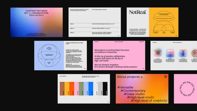
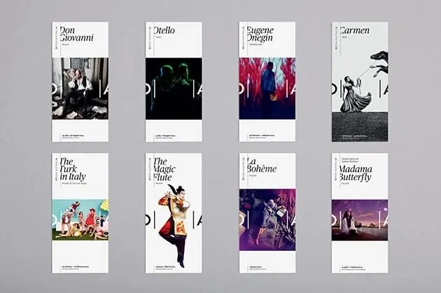
A modular portfolio layout showing six presentation slides using bold typography, minimal color accents (gold, blue, pink), and generous white space with strong black and light backgrounds.
Summary
A portfolio grid of six minimalist slides using display typography, bold color-blocking (gold, blue, pink sections), and alternating black-and-white card backgrounds arranged in a structured layout.
Visual description
Six cards arranged in three rows of two, each representing a distinct presentation or case study. Top-left: dark horizontal card with blue-to-orange gradient background, minimal text. Top-center: white card with small monospace text on light gray. Top-right: white card with large "NotReal" wordmark and gold background area, minimal detail. Middle-left: white card with concentric circle diagram in blue and small text body. Middle-center: bright pink card with large white display typography and small badge icons in right margin. Middle-right: orange/gold background with color-block chart (vertical bars in red, orange, yellow, blue) and text below. All cards use black or dark text on light backgrounds, or white text on colored blocks. Typography is sans-serif, bold and large for headlines. Spacing is generous, with clear breathing room between cards. The overall impression is systematic yet bold, balancing minimalism with striking color choices.
Key takeaway
Typography as the primary design move, with color blocks strategically placed to guide attention. The alternation between light and colored backgrounds prevents monotony while staying minimal. The modular card structure allows individual projects to have visual distinctness while maintaining overall cohesion. Large display type with generous white space conveys confidence and maturity.
Reuse notes
Perfect for design agencies, consultancies, and creative portfolios showcasing multiple projects or case studies. Use this layout when each project needs its own visual identity but unified in a grid system. The gold, blue, and pink color combination is contemporary and works especially well in creative/design industries. Strong for presentation decks or portfolio websites where you want each section to feel like a distinct story but part of one collection.
More like this






Keep what you find
A free account saves references to boards and can send you a weekly email of picks based on what you save.
To see every result, go Pro.