Preview image. Unlock full-res
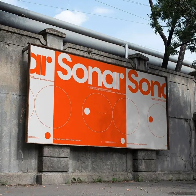
Large-scale outdoor billboard in bright orange and white with bold brand word and minimalist circular geometric patterns, mounted on a concrete industrial building.
Summary
A bold, exterior institutional billboard in bright safety-orange and white featuring large brand lettering and concentric circular diagrams on a weathered concrete industrial facade.
Visual description
Three-panel landscape billboard mounted on a gray concrete building. The dominant typeface is a heavy sans-serif in bright orange, reading "Sonar" repeated across panels, separated by minimalist geometric shapes: concentrically nested circles, single dots, and curved lines rendered in white and a faint orange outline. The background alternates between white and a muted light blue-gray. The concrete wall behind the signage shows weathering and is framed by pipes and utility hardware, emphasizing an institutional, technical context. The composition reads as functional and direct, with no decorative imagery or secondary messaging.
Key takeaway
The contrast between a single vivid color (safety orange) and neutral whites and grays to ensure maximum visibility and legibility at distance; the use of simple, repeating geometric forms (concentric circles, dots) as a logomark system that scales well and works at any size; the confidence in letting negative space and bold typography do all the work.
Reuse notes
Effective for corporate, institutional, or technical organizations where clarity and outdoor visibility matter. The geometric pattern system can be adapted for applications beyond billboards (forms, environmental graphics, digital backgrounds). Works less well for brands targeting emotion or narrative; this approach prioritizes recognition and functional clarity over brand personality.
More like this







Keep what you find
A free account saves references to boards and can send you a weekly email of picks based on what you save.
To see every result, go Pro.