Preview image. Unlock full-res
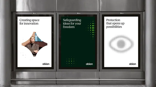
Three vertically stacked billboard panels with contrasting messaging and visual treatments, combining photographic, typographic, and geometric approaches to communicate security and innovation.
Summary
Three vertical billboard panels for Abion communicating innovation, freedom, and protection through distinct visual languages: photography, dark minimalism with geometric pattern, and abstract icons on white.
Visual description
Metal billboard frame housing three equal-width panels separated by black trim. Left panel: white background with bold sans-serif headline ("Creating space for innovation") over a soft-focus photograph of a woman in neutral, warm-toned clothing. Center panel: dark forest-green background with white sans-serif headline ("Safeguarding ideas for your freedom") and a stacked grid of lime-green diamond shapes evoking data protection or network security. Right panel: white background with bold sans-serif headline ("Protection that opens up possibilities") above an abstract pattern of black dots forming an eye or shield silhouette. All three panels carry the Abion logotype at the base.
Key takeaway
Modular grid system that accommodates radically different visual treatments (photography, color-field + pattern, iconography) while maintaining structural cohesion through consistent spacing and typography. The alternating white and dark panels create rhythm and visual rest. High-contrast color choices (white/dark green/black) ensure readability from distance.
Reuse notes
Strong framework for multi-message campaigns where each panel must land independently yet form a cohesive whole. The billboard scale and metal frame suggest corporate, public-facing contexts. Dark green plus lime accents read as tech-forward and secure. Adapt the modular three-column structure to varied content (testimonials, features, benefits) without losing brand unity.
More like this






Keep what you find
A free account saves references to boards and can send you a weekly email of picks based on what you save.
To see every result, go Pro.