Preview image. Unlock full-res
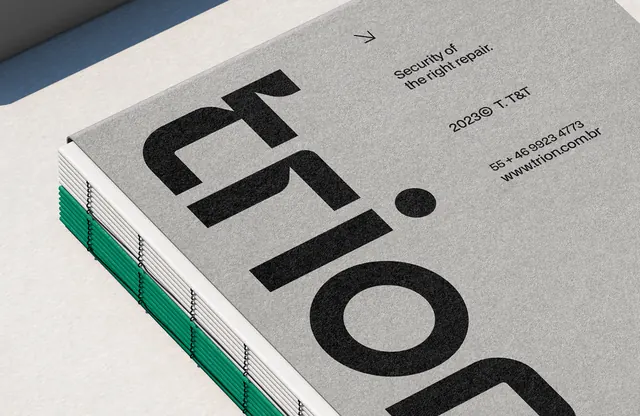
A minimalist printed material showing two interlocking rounded-frame modules in tan and teal-green, with coral accent shapes breaking the frame edges.
Summary
A brand identity or printed collateral detail showing two overlapping rounded-rectangle frame modules in warm neutral tan, nested within a teal-green outer frame on a cool gray background, with coral accent shapes suggesting motion and depth.
Visual description
A top-down photograph of printed material (likely a trifold or multi-page layout) showing a modular frame system. Two inner rounded-rectangle modules in tan sit within a larger teal-green outer frame, all rendered with generous white (paper) space between modules. At the top left corner and bottom right corner, coral-pink accent shapes break out of the frame geometry, suggesting movement or energy. The overall color story is cool (teal frame) and warm (tan modules) with high contrast between the frame hierarchy. The composition uses nested geometry and consistent corner rounding to suggest a cohesive design system. The binding visible on the left edge indicates printed booklet construction.
Key takeaway
The nested frame hierarchy (outer teal, inner tan) creates instant visual distinction and suggests information architecture without text. Accent shapes in a hot color breaking frame boundaries add sophistication and prevent the design from feeling static. The restraint in the palette (three colors + paper) makes the frame system itself the primary graphic interest.
Reuse notes
Strong for printed brand guidelines, portfolio pieces, or corporate identity systems. Works when you want to showcase a modular design system that can be adapted across touchpoints. The cool-warm color pairing (teal/tan) suggests both creativity and professionalism. Best used in applications where the frame system itself carries meaning (e.g., layout grids, information categories). Avoid if content and imagery are the primary focus; this treatment makes the system, not the content, the star.
More like this




Keep what you find
A free account saves references to boards and can send you a weekly email of picks based on what you save.
To see every result, go Pro.