Preview image. Unlock full-res
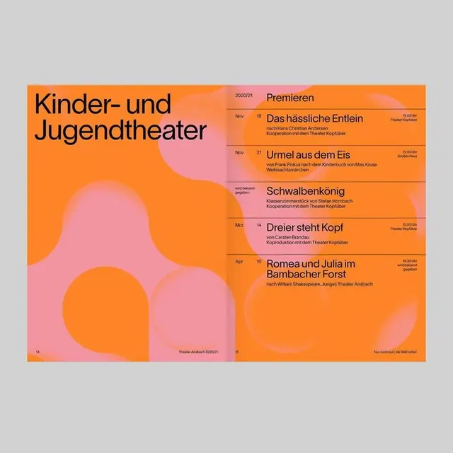
A cultural event brochure for a children's and youth theater, using soft organic shapes in coral and pink over an orange background to list five upcoming productions.
Summary
A minimalist brochure cover for a children's theater using soft, biomorphic shapes in warm tones to announce five upcoming performances.
Visual description
A left-to-right two-panel layout on a bright orange background. The left panel features the dark headline "Kinder- und Jugendtheater" (Children's and Youth Theater) in bold sans-serif, overlaid on soft, rounded organic shapes in coral, light pink, and peach. These shapes are asymmetrically stacked, creating visual depth without rigidity. The right panel lists five productions in a clean, vertical text layout: Premieren, Das halsliche Entlein, Umsel aus dem Eis, Schwabenkoping, Drosler stellt Kogel, Romeo und Julia im Barbarascher Forst. Each title is set in a smaller sans-serif, with thin visual separators. The overall palette remains warm and approachable, balancing organic fluidity with structured information hierarchy.
Key takeaway
The use of soft, amorphous shapes as a design framework for serious content. The organic silhouettes offset the rigidity of the event list, making the brochure feel approachable rather than clinical. The warm color palette keeps children's theater accessible while the minimal typography keeps information scannable.
Reuse notes
Strong for arts, cultural, and educational institutions targeting families or young audiences. The organic shapes work especially well paired with clean, geometric type. The warm palette suits nonprofits and community events; adapt the shape treatment and color for different verticals.
More like this




Keep what you find
A free account saves references to boards and can send you a weekly email of picks based on what you save.
To see every result, go Pro.