Preview image. Unlock full-res
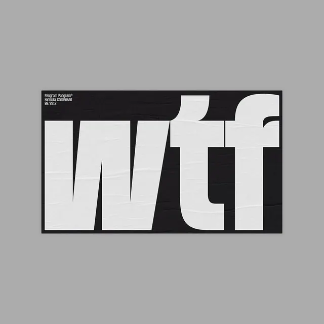
Bold geometric wordmark treatment combining organic and angular forms in high-contrast black and white.

Summary
An experimental geometric type treatment spelling WTF through overlapping, interlocking organic and angular letterforms.
Visual description
Large-format letter artwork on a light gray background. The letters are constructed with a mix of curved concentric lines (creating an organic bulge effect) and stark angular rectangles. Monochrome composition in jet black (#1E1C1F) against off-white (#B8B8B8). The letterforms deliberately break the boundaries between each character, creating overlapping zones that blur where one letter ends and another begins. A small credit line appears in the upper left (Pangram Pangram, 09/2018). Centered composition with generous breathing room.
Key takeaway
Geometric type as a sculptural form. The interplay of curved and angular geometry, plus the deliberate overlap strategy, transforms simple letters into a complex visual puzzle. Demonstrates how negative space and form-breaking create visual interest and playfulness in typography.
Reuse notes
Ideal for design studios showcasing experimental typography or modern design thinking. Works as a social-media teaser (announcement of a typeface release per the caption). Best reproduced large to show the detail and overlap strategy. Strictly black and white makes it versatile for brand applications. Avoid scaling below display size or the intricacy is lost.
More like this

Keep what you find
A free account saves references to boards and can send you a weekly email of picks based on what you save.
To see every result, go Pro.