Preview image. Unlock full-res
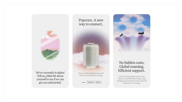
Three-card mobile service comparison design using soft gradients, pastel hues, and blurred landscape imagery to convey global connectivity.
Summary
Three-card mobile service comparison design using soft gradients, pastel hues, and blurred landscape imagery to convey global connectivity.
Visual description
Three vertically-stacked cards arranged in a horizontal row on a light background. Left card shows a blurred landscape with pink sky and green terrain, captioned "We're currently in alpha" with an onboarding call-to-action. Center card features a tall ridged device form against a blurred pink and brown gradient, labeled "Popcorn. A new way to connect" with service options (Local, Regional, Global) and copy about unlimited cellular and satellite technology. Right card displays a blurred sky with birds, headlined "No hidden costs, Global roaming, Efficient support" with body text about service features. All cards use rounded corners and consistent sans-serif typography in dark gray on light backgrounds. The gradients and blurred photographic elements create a soft, approachable aesthetic.
Key takeaway
The soft gradient blur treatment on photography creates depth without hard imagery; the three-column card format cleanly compares distinct value propositions; the product-form imagery (center card) anchors the feature set visually.
Reuse notes
Effective for mobile or connectivity service marketing that needs to feel modern yet accessible. The blurred imagery softens what could be stark product comparisons. Works best when each card has distinct copy and a clear hierarchy of features.
More like this


Keep what you find
A free account saves references to boards and can send you a weekly email of picks based on what you save.
To see every result, go Pro.