Preview image. Unlock full-res
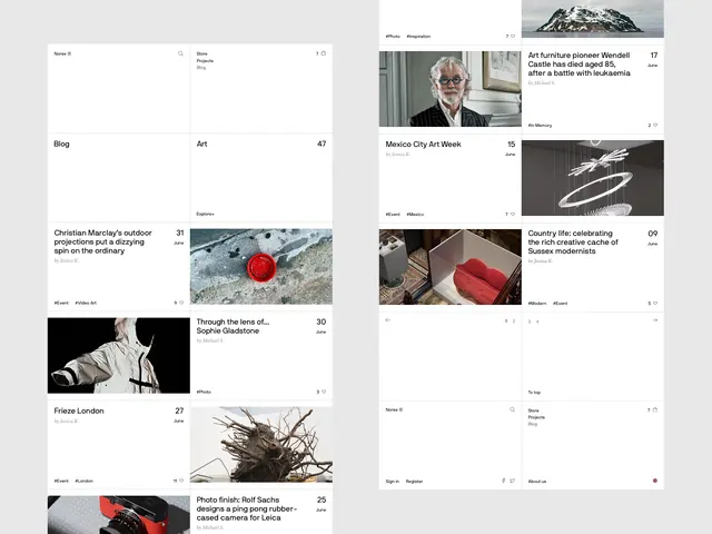
Two-page editorial layout combining photography, typography, and colored accent blocks in an asymmetric grid arrangement with strong visual hierarchy.
Summary
A two-page editorial spread arranging landscape and portrait photography, typographic elements, and text blocks across an intentionally irregular grid that guides the eye through multiple focal points.
Visual description
Left-hand page features a landscape mountain photograph at top, with body text blocks of varying widths below, interspersed with smaller images (portraits, detail shots, typography experiments in black and white). Right-hand page mirrors the composition with a larger portrait photo, numbered figure references, body text, and a solid-colored accent block (warm tan or cream) alongside the photography. Text blocks are set in a serif font at different sizes, creating rhythm and hierarchy. The overall grid is not uniform: image widths vary, text columns step in and out, and the tan block punctuates one section. The palette remains strictly monochrome and muted tones, allowing the photography and composition to carry the visual weight.
Key takeaway
The asymmetric grid that feels organized yet dynamic: not rigid, but clearly structured. Using colored accent blocks sparingly (one block per spread) to punctuate the monochrome palette without overwhelming it. Varying the image sizes and text column widths keeps the eye moving and adds editorial energy without clutter.
Reuse notes
Strong template for magazine, journal, or editorial design. Works well for brands and publications that position themselves as intelligent, crafted, and design-forward. The monochrome + single-color-accent approach is economical for print and works across both physical publication and digital media. Avoid for heavily illustrated or commercial-tone brands; best suited for editorial, cultural, or premium institutional contexts.
More like this

Keep what you find
A free account saves references to boards and can send you a weekly email of picks based on what you save.
To see every result, go Pro.