Preview image. Unlock full-res
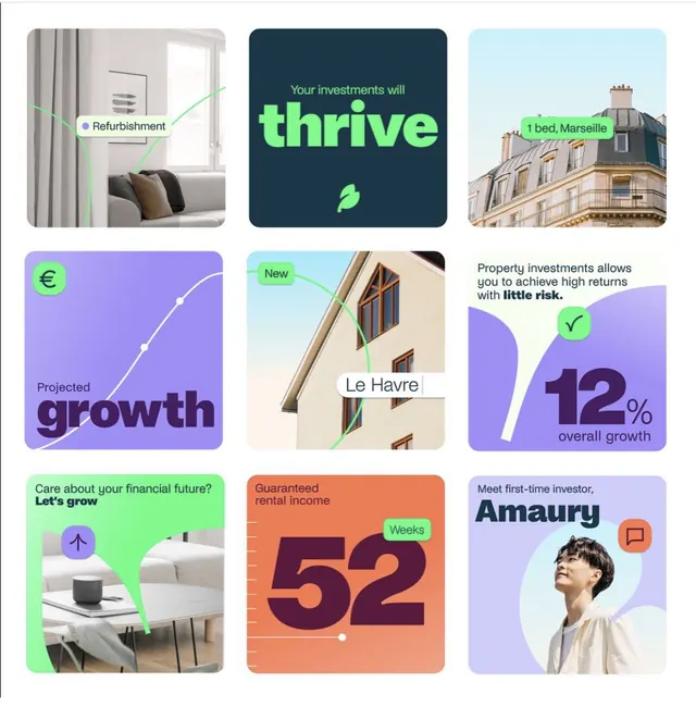
Grid of nine illustrated 3D geometric modules in neon green, purple, and teal, representing fintech concepts with playful rounded shapes and property imagery.
Summary
A fintech marketing illustration using a 3x3 grid of colorful 3D modules with neon accents, showing investment concepts (refurbishment, growth projections, property locations) layered over property photographs and bold typography.
Visual description
Nine rounded-corner cards arranged in a 3x3 grid, each combining a distinct background color (green, purple, light blue, or coral) with photographic elements or typographic callouts. Left column: green cards with interior/property photos and labels (Refurbishment, New, Care about your financial future); center column: dark navy with bright lime-green text (Thrive logo and branding), light blue with building facade and location label, orange with large percentage figures; right column: light blue with Marseille property photo and bedroom count, purple with growth percentages and checkmark icon, lavender with a portrait photo and investor name. Throughout, lime-green circular accent badges and curved connector lines link related elements. Typography mixes bold sans-serif headlines with smaller sans-serif body text. Palette is dominated by neon green (#9E8FEF purple, cool teals, warm coral, and crisp white space.
Key takeaway
The neon-green accent color cutting through muted and vibrant backgrounds creates visual hierarchy without drowning detail. Layering photography behind translucent cards and curved connectors ties disparate content together. Using rounded corners, bold typography, and color blocking makes dense information (metrics, locations, benefits) feel approachable and playful.
Reuse notes
Strong reference for fintech or proptech marketing materials targeting younger investors. The 3x3 grid scales well for pitch decks, landing pages, or infographics explaining investment returns or portfolio benefits. Works best when property or real-world assets are part of the story. The bright color palette is deliberately friendly and energetic, not corporate; pair with professional sans-serif type if you want to maintain credibility with institutional audiences.
More like this




Keep what you find
A free account saves references to boards and can send you a weekly email of picks based on what you save.
To see every result, go Pro.