Preview image. Unlock full-res
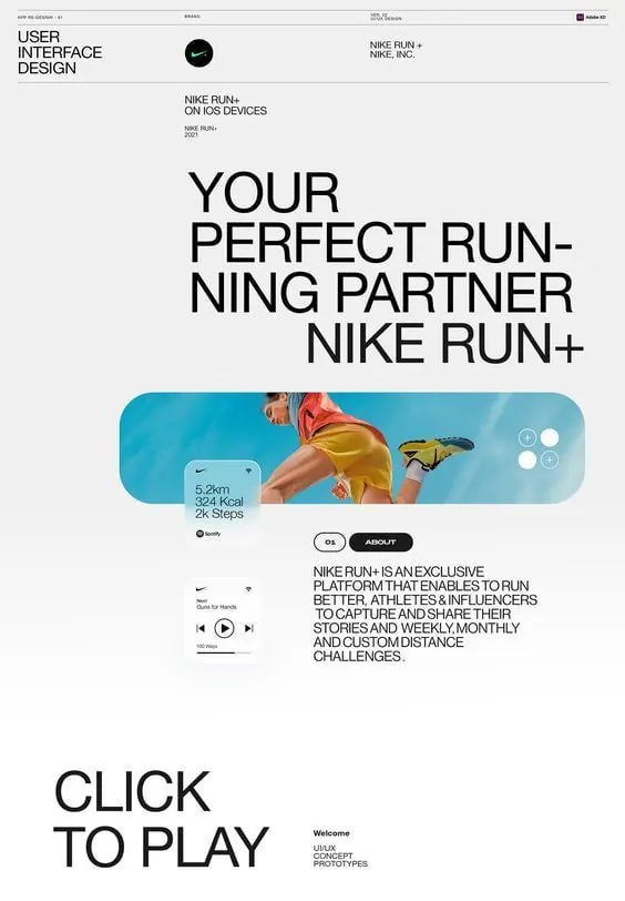
Light-theme app UI case study for Nike Run+ showing modular card layout, teal accent color, and embedded fitness metrics on a clean minimal grid.
Summary
Light-theme athletic app UI (Nike Run+ for iOS) layering running data into cards with a teal accent color and clean typography hierarchy on a minimal pale grid.
Visual description
Light off-white background with thin gray dividing lines. Top section has the app header, Nike branding mark, and section label. Center showcases a hero card with teal background, rounded corners, and a photo of a runner in athletic wear (cropped closely). Overlaid card shows run stats (distance, calories, step count) in a minimal teal-and-white layout. Below, a play-music player strip with song title and playback controls in small sans-serif. Large sans-serif headline reads "YOUR PERFECT RUNNING PARTNER NIKE RUN+" stacked in a centered hierarchy. Further down, descriptive body copy in smaller sans-serif explains the platform. Bottom section has a "CLICK TO PLAY" call-out in large type and supporting links.
Key takeaway
The use of a single teal accent color to unify data cards and call-to-action elements across a light background. The rounded-corner card containing both imagery and stats, creating a single focal point. Stacking the headline across multiple lines for visual emphasis without disrupting the grid. Clean typographic hierarchy using one sans-serif family and size changes only.
Reuse notes
Effective for fitness app showcases, sports brand websites, or performance-data displays. Works best on light backgrounds where the teal accent reads as energy. Use the card + accent pattern for mobile apps emphasizing user stats or achievements. The layout is accessible for small screens; the typography-first approach emphasizes content over decoration.
More like this

Keep what you find
A free account saves references to boards and can send you a weekly email of picks based on what you save.
To see every result, go Pro.