Preview image. Unlock full-res
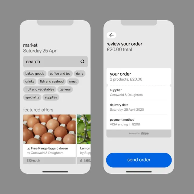
Two mobile screens for a marketplace app: a product discovery screen with search, category tags, and featured items; and an order review screen showing cart total and Stripe payment confirmation.
Summary
Two-screen mobile marketplace interface combining product discovery with keyword search, categorical filtering, featured items, and an order confirmation flow backed by Stripe payment.
Visual description
Left screen shows a light background with search bar, horizontal tag filters (baked goods, coffee and tea, dairy, etc.), and a featured offers section displaying product cards with images, titles, suppliers, and pricing. Right screen displays an order review summary with back-arrow navigation, cart contents (2 products at 20 pounds total), supplier details, delivery date, payment method, and a prominent blue "send order" button. Stripe branding appears at bottom of payment section. Typography is clean sans-serif in gray and dark text; color palette is neutral (gray, white) with teal/green category tags and a strong blue CTA button.
Key takeaway
The categorical tag filtering system for narrowing product discovery without cluttering the interface. The order-review layout separates cart items, metadata, and payment into distinct zones for scanability. The strong blue CTA button stands out against muted backgrounds for conversion.
Reuse notes
Effective for food delivery, marketplace, or B2C ecommerce apps. The tag-based filtering pairs well with grid product layouts. Consider this pattern when designing review/confirmation flows for transactional apps; the clear hierarchy guides users to the final action without distraction.
More like this




Keep what you find
A free account saves references to boards and can send you a weekly email of picks based on what you save.
To see every result, go Pro.