Preview image. Unlock full-res
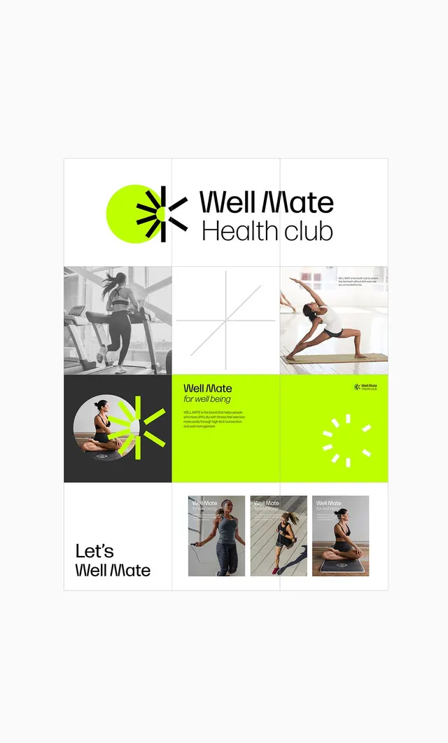
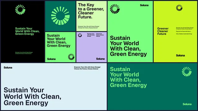
Modular brand guideline layout with lime-green accent icon, photography grid, and health-club messaging organized in aligned blocks.
Summary
Modular brand guideline layout with lime-green accent icon, photography grid, and health-club messaging organized in aligned blocks.
Visual description
A comprehensive brand identity presentation for "Well/Mate Health Club" organized as a three-column grid. Top section shows the logo (a bright lime-green circular shape with radial lines emanating outward) paired with clean sans-serif wordmark. Grid contains lifestyle photography of people exercising and yoga poses, rendered in black and white, interspersed with white and lime-green accent blocks. A large lime-green panel contains the tagline "Well Mate for well being" with brand description text. Bottom row displays three smaller product/card mockups. The entire layout sits against white, using only black type, photography, and the single lime-green accent color.
Key takeaway
The modular block-and-grid approach balances photography, typography, and a single bold accent color without clutter. The radial-line icon works at any size and pairs seamlessly with type. Using one vibrant accent against black/white/grey neutrals creates visual energy without overwhelm.
Reuse notes
Strong reference for healthcare, fitness, or wellness brands needing a modern, energetic system that feels professional. The photography-plus-geometry balance works for membership-based services, gym brands, or health apps. Icon and grid pattern are easily adaptable.
More like this






Keep what you find
A free account saves references to boards and can send you a weekly email of picks based on what you save.
To see every result, go Pro.