Preview image. Unlock full-res
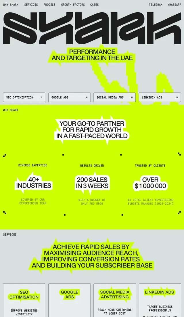
Digital marketing landing page using extreme contrast: black bold sans-serif type and lime neon highlights on light gray, organized with service cards and testimonial stats.
Summary
Digital marketing agency page using extreme contrast (neon lime highlights against black type and light gray) to grab attention and direct focus to services and performance metrics.
Visual description
A two-tier layout: narrow navigation bar at the top (site name "Shark" in thick geometric sans-serif with linked sections); below, a large hero section on light gray background containing the oversize black headline "Performance and Targeting in the UAE" with bright lime neon shape behind it. Four button-outlined service cards (SEO Optimisation, Google Ads, Social Media Ads, LinkedIn Ads) span horizontally, each with a lime neon shape behind its label. Lower section features three stat blocks with lime background (40+ Industries, 200 Sales in 3 Weeks, Over $1,000,000) followed by another gray section repeating the four service cards with descriptive text.
Key takeaway
The single neon color (lime) deployed strategically to highlight key elements and break visual monotony on a neutral gray-white palette. All-caps heavy sans-serif type for immediate authority. The consistent grid structure and service-card pattern makes the offering scannable. Using bright color selectively rather than everywhere keeps the design from feeling garish.
Reuse notes
Strong for B2B marketing, performance consulting, and SaaS landing pages targeting high-intent users. The high contrast demands confident messaging; suits data-backed or outcome-focused services. Can feel aggressive if the neon color is changed; lime green is doing much of the work here. Works well on desktop; may need refinement on mobile due to dense information hierarchy.
More like this


Keep what you find
A free account saves references to boards and can send you a weekly email of picks based on what you save.
To see every result, go Pro.