Preview image. Unlock full-res
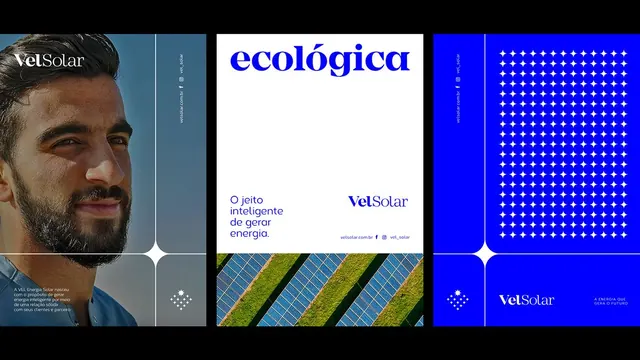
Energy company brand identity using three vertical panels: photographic portrait, logo lockup with solar diagonal motif, and geometric star pattern on electric blue.
Summary
A renewable energy brand system across three vertical panels: a bearded man in teal-toned portrait, a logo and solar-panel diagonal motif, and a bright blue field with a geometric white star pattern.
Visual description
Left panel: portrait photograph of a man with warm skin tone against a muted teal background, with small geometric icon. Center panel: white background featuring the logotype "ecológica" in bold blue sans-serif, a sentence in Portuguese describing intelligent energy management, and a diagonal stripe motif combining solar panels (blue and yellow photovoltaic grid) with bright lime-green grass. Right panel: electric blue background filled with a geometric repeating white four-pointed star or cross pattern, anchored with the company name "VelSolar" in white sans-serif at bottom-right.
Key takeaway
The triptych format for brand identity systems, separating human/portrait, logo/messaging, and pattern/brand expression. The diagonal solar-panel element as an abstract metaphor for renewable energy. The extreme color contrast (electric blue with white geometric) for brand memorability and digital reproduction. The consistent geometric icon language across panels.
Reuse notes
Strong template for renewable energy, solar, cleantech, and B2B environmental services. The teal-to-blue color progression suggests stability and forward-thinking. Works especially well for companies needing to balance corporate credibility (portrait, clean sans-serif) with innovation (geometric patterns, electric color). The diagonal motif repeats well across applications and merges brand concept with product hint (solar arrays).
More like this







Keep what you find
A free account saves references to boards and can send you a weekly email of picks based on what you save.
To see every result, go Pro.