Preview image. Unlock full-res
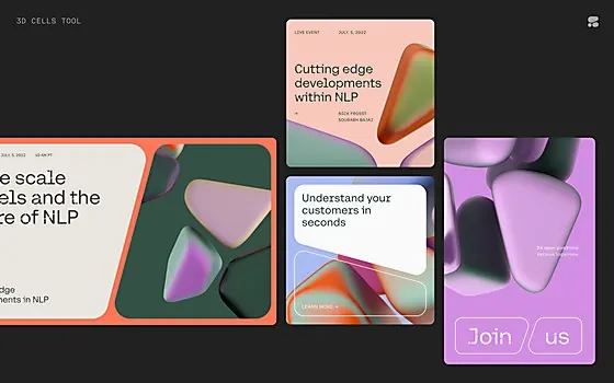
A dark-mode design system for NLP/AI tools featuring three rectangular cards with soft gradient overlays (purple-to-pink, orange tints, green tones) stacked asymmetrically, demonstrating color role assignment and depth layering.
Summary
Three overlapping rectangular cards on a very dark gray-green background, each filled with a soft gradient (magenta-to-pink, orange-to-tan, teal-to-green), arranged asymmetrically to show depth and color application patterns in a minimal data-science design system.
Visual description
Near-black background with slight warm undertone. Three rounded-rectangle cards overlaid asymmetrically: card 1 (top-left) deep purple-to-pink gradient; card 2 (center-right, larger) soft peach-to-tan gradient with slight warm glow; card 3 (right) soft green-to-teal gradient. Cards appear layered with subtle drop shadows. No visible text or UI elements. All cards maintain soft, muted saturation despite warm and cool gradients. The composition is horizontally biased with generous breathing room on the left.
Key takeaway
The color-role system: each card demonstrates a distinct gradient role (primary accent, secondary surface, tertiary/data-viz). Soft saturation levels prevent the gradients from feeling garish despite warm tones. The asymmetric stacking with overlap creates visual interest and implied hierarchy without a grid. The dark background makes even muted gradients pop, perfect for dark-mode products.
Reuse notes
Strong pattern for AI/data platforms that need a warm-and-cool color balance (e.g., showing model inputs in one tone, outputs in another). The card depth and gradient approach suits data-visualization dashboards. Works especially well for technical products targeting developers or data scientists who expect visual sophistication without trendy flashiness.
More like this






Keep what you find
A free account saves references to boards and can send you a weekly email of picks based on what you save.
To see every result, go Pro.