Preview image. Unlock full-res
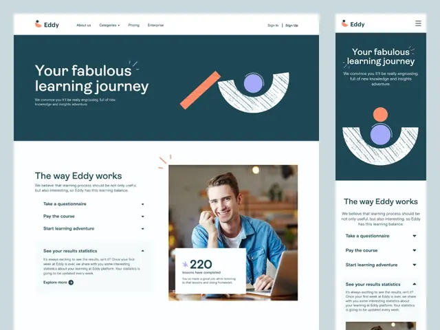
Responsive edtech interface with dark teal header, centered circular progress graphic (orange and purple arcs), centered portrait photo, and bulleted text steps below.
Summary
Responsive onboarding layout with dark teal horizontal header banner, hand-drawn circular progress graphic in warm accent colors, centered portrait photo, and left-aligned bulleted text describing a learning workflow.
Visual description
Two-column responsive layout. Left desktop panel shows a dark teal header banner (roughly one-third of height) with white headline and subheading text. Below, a circular progress icon hand-drawn in orange and purple arcs sits above a portrait photo framed in a white border. Below the photo is small text stating "220". The right mobile panel mirrors the same elements in a vertical stack with adjusted proportions. All typography is clean sans-serif in white or dark text on light/dark grounds. The composition uses ample white negative space against the teal background, establishing a clear visual rhythm.
Key takeaway
The circular hand-drawn arc as a lightweight progress indicator (vs a traditional step-counter or linear bar). The pairing of a portrait photo with supporting text to humanize onboarding. The responsive side-by-side layout showcasing both desktop and mobile simultaneously within one composition.
Reuse notes
Ideal for educational platforms, SaaS onboarding, or learning-journey sequences where steps are sequential but non-linear. The teal and warm accents read as friendly and trustworthy without heavy branding. Works well when the image is a real person (not generic).
More like this
Keep what you find
A free account saves references to boards and can send you a weekly email of picks based on what you save.
To see every result, go Pro.