Preview image. Unlock full-res
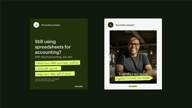
Paired campaign cards for an accounting software brand using dark green and off-white backgrounds with contrasting yellow highlights and portrait photography.
Summary
Two campaign cards for cloud accounting software: one poses a problem on dark green, the other shows human connection and outcome on off-white, both unified by yellow accent highlights and a shared "A" icon badge.
Visual description
Left card: dark olive-green rectangle with circular white badge containing stylized "A" logo and "Accurate curacao" type. Bold white sans-serif headline "Still using spreadsheets for accounting?" anchors the upper half. Three yellow-highlighted bullet points (in cursive handwriting style) list benefits: "Access your data anywhere, anytime", "Automate reports", "Keep your data safe & secure". Small gray text at the bottom directs to website; "Accurate." logo and mark in bottom right corner.
Right card: off-white background with matching icon badge and branding in the upper left. Large portrait photograph of a smiling man in a dark t-shirt occupies the center half of the card, shot against warm office lighting and interior. Overlaid on the photograph in white serif type: "Together we grow". A yellow-highlighted handwritten-style phrase floats below the photo: "Together we reach new heights". "Accurate." logo anchors the bottom right.
Key takeaway
The dual-card format contrasting problem and solution across different visual treatments (dark/analytical vs light/human). The consistent use of yellow as a unifying accent and callout mechanism that draws the eye across both pieces. The pairing of analytical copy (three bulleted features) with emotional narrative (portrait + tagline) to address both rational and emotional purchase drivers.
Reuse notes
Works well for B2B SaaS or fintech brands needing to balance feature benefits with company culture/trust signals. The yellow highlight technique pairs effectively with dark and light card backgrounds. Suits campaign spreads, case studies, or landing-page hero pairs. Handwritten-style text adds approachability without casualness when set against structured sans-serif headlines.
More like this



Keep what you find
A free account saves references to boards and can send you a weekly email of picks based on what you save.
To see every result, go Pro.