Preview image. Unlock full-res
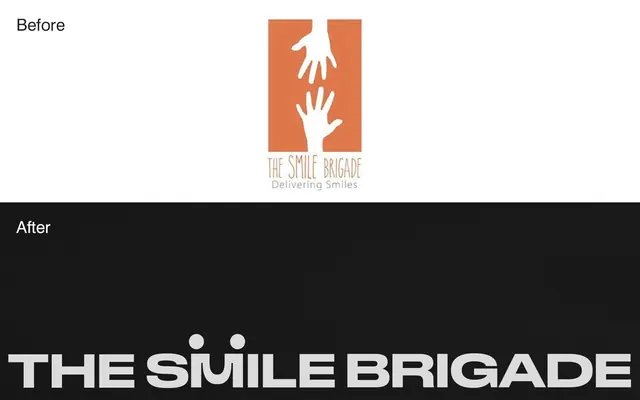
Before-and-after identity redesign showing a hand-based logo evolution for The Smile Brigade nonprofit.
Summary
A before-and-after identity redesign for The Smile Brigade, contrasting the original illustrated logo with simplified hands against a revised, cleaner wordmark lockup with warmer tones.
Visual description
A two-part composition dividing the image at a diagonal from lower left to upper right. The top "Before" section shows an earlier logo: two white hand silhouettes reaching toward each other on a rust-orange rectangular background, with serif tagline "Delivering Smiles" below. The bottom "After" section presents a redesign: "THE SMILE BRIGADE" in bold, clean sans-serif type centered on black. The redesign uses a more mature, professional approach while maintaining the warm color accent of the original palette. The split layout demonstrates clear visual progression.
Key takeaway
The power of simplification and type-forward design in nonprofit branding. The redesign trades illustrative charm for professional clarity, making the name the primary visual asset. Color remains consistent, providing continuity between versions.
Reuse notes
Strong example for nonprofit brand evolution or for case studies showing design process. The before-and-after format is excellent for portfolio work or client presentations. The warm accent color (rust) over the dark background is a reusable palette combination for mission-driven organizations.
More like this



Keep what you find
A free account saves references to boards and can send you a weekly email of picks based on what you save.
To see every result, go Pro.