Preview image. Unlock full-res
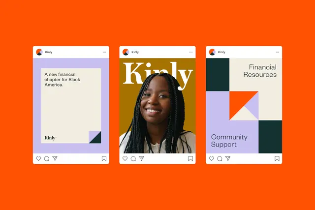
Three coordinated Instagram cards using bold orange background, portrait photography, and geometric color blocks to communicate financial empowerment and community support.
Summary
Three coordinated social-media cards for Kirby (financial-literacy nonprofit) layering portrait photography, layered geometric accent blocks, and bold typography over a vivid orange full-bleed background.
Visual description
Three vertical cards arrayed horizontally, each with a bright-orange surround containing a white central post area. Left card: portrait of woman with text "A new financial chapter for Black America" and brand wordmark, with a small purple and teal geometric triangle in lower corner. Center card: larger portrait photograph of woman, with "Kirby" display text overlaid on an olive-toned banner section. Right card: minimal layout with "Financial Resources" and "Community Support" labels, supported by geometric blocks in purple, orange, teal, and black. Each card has the Kirby brand icon, engagement icons (heart, comment, share, bookmark) at bottom. Typography is clean sans-serif, with generous whitespace and strong color separation between text and image areas.
Key takeaway
The layered approach: portrait as anchor, geometric color blocks for visual interest and hierarchy, and background color as unified gallery identity. The mix of organic imagery with hard geometric shapes reads modern and intentional. Each card stands alone but the set feels coordinated through consistent chrome (icons, type treatment, palette).
Reuse notes
Fits nonprofit social campaigns, especially those centering community faces and messaging. The bright background ensures scroll-stopping presence in social feeds. Works for awareness, educational, or service-focused messaging. Best with compelling human-centered photography; avoid heavy copy overlays on faces.
More like this





Keep what you find
A free account saves references to boards and can send you a weekly email of picks based on what you save.
To see every result, go Pro.