Preview image. Unlock full-res
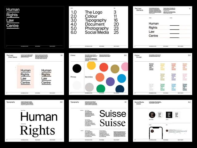
Swiss grid-based brand guide for a legal nonprofit, with numbered hierarchy levels, systematic color palette, and modular layout templates.
Summary
A comprehensive brand system for a legal nonprofit showing nine layout templates, a six-tier information hierarchy, a carefully restrained color palette of black, white, warm neutrals, and a single accent yellow, plus typography and icon specimens.
Visual description
Nine template pages in a 3x3 grid demonstrate layout variations and page applications. A numbered scale (1.0 through 6.0) explains information hierarchy levels and their uses. The color palette spans black, white, light gray, warm brown, muted taupe, mustard yellow, terra cotta, coral, cobalt, and forest green in controlled swatches. Two pages show the logotype with legal service categories (Photography, Document, Graphic Design, Social Media) applied. Large-format "Human Rights" and "Suisse Suisse" wordmark samples, a grid-system guide, and icon family variants complete the system.
Key takeaway
The numbered hierarchy scale makes information priority explicit and teachable rather than intuitive. The color palette balances restraint (mostly neutrals) with strategic accents (yellow, terra cotta) to signal authority without coldness. Grid cells and consistent spacing keep every page legible and reproducible.
Reuse notes
Essential reference for nonprofit or legal branding: demonstrates how to build a system that feels institutional without being sterile. Works well as a model for internal teams that need clear, rule-based design guidance. The modular template set is practical for collateral planning.
More like this




Keep what you find
A free account saves references to boards and can send you a weekly email of picks based on what you save.
To see every result, go Pro.