Preview image. Unlock full-res
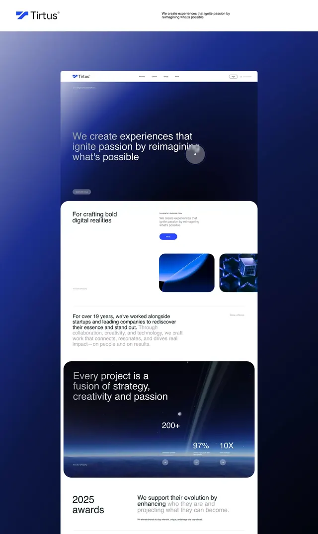
Dark blue gradient SaaS landing page with stacked product cards, testimonial quote, and bold metrics callout.
Summary
SaaS landing page with a deep-blue gradient background, stacked product showcase cards, and a bold metrics section anchoring the design.
Visual description
A dark-mode page with a gradient background transitioning from deep navy to purple-blue. At the top, a white header bar holds the Tirtus logo and navigation. The hero section features large white headline type ("We create experiences that unify passion by reimagining what's possible") with a circular video or image thumbnail. Below are two white card sections: one showcasing product screenshots side by side, and another stating "2025 awards" with a stat callout ("200+", "87%", "10X" metrics). The layout is centered and stacked vertically, with ample whitespace framing each content block.
Key takeaway
The gradient backdrop creating depth without visual clutter, the card-based stacking that segments product info clearly, and the integration of concrete metrics as a persuasion element (social proof).
Reuse notes
Strong default for developer-tool or SaaS companies aiming for premium credibility. The dark mode reads expensive and technical. Works well when you have specific product screenshots and real metrics to anchor the narrative.
More like this





Keep what you find
A free account saves references to boards and can send you a weekly email of picks based on what you save.
To see every result, go Pro.