Preview image. Unlock full-res
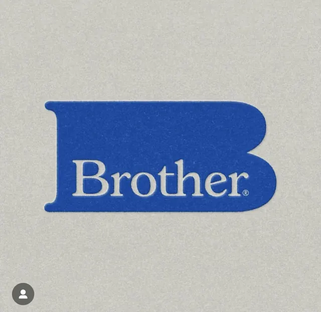
The iconic Brother Corporation logo: a blue ribbon banner containing serif-set 'Brother' in white, a heritage symbol of industrial reliability.
Summary
The Brother brand's signature logo: an evocative blue ribbon shape containing serif-lettered "Brother" in white, communicating institutional permanence and industrial trust.
Visual description
A horizontally-oriented blue ribbon form with soft rounded caps at each end, containing the word "Brother" in elegant white serif typeface, centered. The ribbon employs a saturated royal blue (#234B9F) creating strong contrast against the pale beige background. The serif letterforms are classic and refined, set in white with enough weight and spacing to command presence without heaviness. The composition is perfectly centered with generous negative space on all sides, set against a neutral off-white textured background suggesting paper stock or vintage branding material.
Key takeaway
The ribbon/banner shape as a badge container, giving the type a sense of authority and framing without a box. The serif choice for an established, heritage-facing brand. The restraint: one color plus type, no additional ornament or complexity.
Reuse notes
Archetypal for B2B industrial or office-equipment brands positioning themselves as reliable and established. The serif + blue combination works across manufacturing, business-service, and institutional contexts. Works poorly for playful, startup, or consumer-first positioning. The centred, symmetrical composition suits formal documentation, certificates, or primary branding. Can pair with secondary wordmark or secondary color in extended systems.
More like this

Keep what you find
A free account saves references to boards and can send you a weekly email of picks based on what you save.
To see every result, go Pro.