Preview image. Unlock full-res
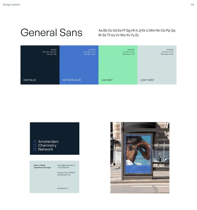
Design system page showcasing General Sans typography with a four-color palette and applied brand applications for a chemistry network organization.
Summary
A design system documentation page for Amsterdam Chemistry Network, presenting General Sans typeface, a four-color palette (deep blue, network blue, lab mint, light mint), and brand applications including a business card and street billboard mockup.
Visual description
Top section displays "General Sans" typography specimen in large display weight, with the full alphabet shown at smaller scale. Below that, a four-color palette bar separated into labeled swatches: deep blue (dark navy), network blue (medium bright blue), lab mint (bright seafoam green), and light mint (pale grey-green), each with hex codes visible. Bottom section shows real-world applications: a dark blue business card for an operations manager with name, title, and contact details on light mint background; and a large street-level billboard photograph showing the brand applied to an urban storefront, featuring the blue mark, organizational name in stacked layout, and imagery of diverse people. All typography is clean, modern sans-serif with generous whitespace.
Key takeaway
The system approach: pairing a typography specimen with an applied color palette and concrete mockups (card + environmental) anchors the brand language. The restraint (four colors, one typeface) creates coherence. Using real-world context (street activation, business collateral) shows how the system works in practice.
Reuse notes
Ideal template for B2B science, research, and professional services brands. The cool palette (blues and teals) naturally reads as trustworthy and scientific. Works well for networking organizations, labs, or technical consultancies. The modular grid layout adapts easily to additional brand elements (icons, photography rules, etc.). Best paired with documentary or photographic imagery rather than illustration.
More like this






Keep what you find
A free account saves references to boards and can send you a weekly email of picks based on what you save.
To see every result, go Pro.